Table of Contents
Extends: Group
Description
The Poster node class draws an image with the top/left corner located at the origin of the node local coordinate system. Because the Poster node class extends the Group node class, a Poster node can have child nodes. For example, a Poster node might have a Label node as a child that draws an annotation on top of the poster.
The Poster node class supports JPEG and PNG image files.
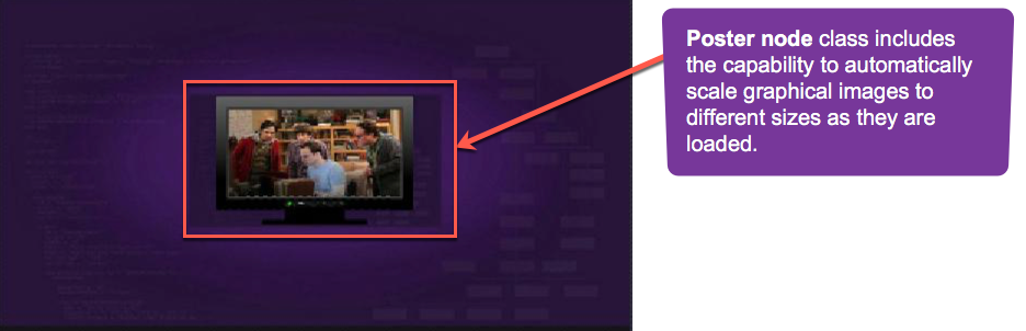
The Poster node class includes the capability to automatically scale graphical images to different sizes as they are loaded, by setting the loadWidth and loadHeight field values. After the graphical images are loaded, the images can be scaled to fit within the target screen element area specified by the width and height field values. To use this capability, select the scaling option you want as the value of the loadDisplayMode field.
See SceneGraph's Texture Memory feature for more information.
uri field.Best Practice when using this node
- Avoid loading either very large images (larger than the target screen dimensions), or very small images, with the intent of the firmware scaling to a certain design intention. These can cause an unsatisfactory appearance, or even application issues such as degraded performance.
- For the best appearance and application performance load images either identical to, or close to, the intended target screen dimensions of the Poster node in your application design.
- Set the dimensions of an image in your design by setting the Poster node
widthandheightfields.
If you do not set these fields, designs implemented in certain forms of XML markup may not render as intended, unless you use an explicit callback layout function triggered by the Poster nodeloadStatusfield, to render the screen element after the image has loaded and the dimensions are known.
Example
The following example is a poster image placed using Poster node:
Autoscaling
When autoscaling between FHD/HD, there may be cases where using images with widths or heights that are not divisible by 2 (i.e. even numbers) do not work correctly.
Fields
| Field | Type | Default | Use | ||||||||||||
|---|---|---|---|---|---|---|---|---|---|---|---|---|---|---|---|
| uri | string | "" | Specifies the URI of the image file. Images included as part of the application package can be referenced using the pkg:/images prefix. Images included as part of the application package that are to be localized can be referenced using the pkg:/locale/images/ prefix (see Localizing Graphical Images in the Application Package). | ||||||||||||
| width | float | 0.0 | Specifies the width of the image in local coordinates. If set to 0.0, the width of the bitmap from the image file is used. If set to a value greater than 0.0, the bitmap is scaled to that width. | ||||||||||||
| height | float | 0.0 | Specifies the height of the image in local coordinates. If set to 0.0, the height of the bitmap from the image file is used. If set to a value greater than 0.0, the bitmap is scaled to that height. | ||||||||||||
| loadSync | Boolean | false | Controls whether the image is loaded synchronously in the render thread, and appears immediately, or loaded asynchronously in a background thread, and may not appear immediately. If set to true, and the uri field specifies a local file (in the pkg:/images directory), the image is loaded synchronously, and appears immediately. If set to false, or if the uri field specifies a file from a remote server (a URL starting with http: or https:), the image is loaded asynchronously in a background thread, and may not appear immediately. Be careful when setting this field to true, as it might cause brief glitches in the rendering while the image is being fetched and loaded. | ||||||||||||
| loadWidth | float | 0.0 | Scale the graphical image to the specified width when loaded, preserving aspect ratio. If set to the default, no load-time scaling occurs. If the width field is not set, the loadWidth field is used as the default width of the displayed image. | ||||||||||||
| loadHeight | float | 0.0 | Scale the graphical image to the specified height when loaded, preserving aspect ratio. If set to the default, no load-time scaling occurs. If the height field is not set, the loadHeight field is used as the default height of the displayed image. | ||||||||||||
| loadDisplayMode | option string | noScale | Provides automatic scaling of graphical images after loading. If you intend to load very large graphical images, such as larger than the user interface resolution, you must set one of the scaling options other than
| ||||||||||||
| loadStatus | value string | "none" | Read-Only
| ||||||||||||
| bitmapWidth | float | 0.0 | Read-Only After the graphical image file is loaded, contains the width of the graphical image in pixels | ||||||||||||
| bitmapHeight | float | 0.0 | Read-Only After the graphical image file is loaded, contains the height of the graphical image in pixels | ||||||||||||
| bitmapMargins | associative array | invalid | Read-Only This field is set to an associative array with four elements "left", "right", "top" and "bottom". If the Poster's bitmap is a 9-patch image, the associative array is set to margin info encoded along the right and bottom edges of the image. If the Poster's bitmap is not a 9-patch image, all values in the associative array are set to 0. The bitmapMargins field is set whenever the Poster's loadStatus field changes (e.g. when the bitmap has been loaded). Available since firmware version 7.5 | ||||||||||||
| blendColor | color | 0xFFFFFFFF | Can be used to tint the image by multiplying the color of each pixel by the specified value. If this value is not set to a value other than the default value, no color blending will be performed. | ||||||||||||
| loadingBitmapUri | string | "" | Specifies a bitmap file to display while the poster image is loading. | ||||||||||||
| loadingBitmapOpacity | float | 1.0 | Used to control the rendering opacity of the graphical image that indicates a bitmap is loading. This value multiplies the Poster node opacity. | ||||||||||||
| failedBitmapUri | string | "" | Specifies a bitmap file to display when the poster image failed to load. | ||||||||||||
| failedBitmapOpacity | float | 1.0 | Used to control the rendering opacity of the graphical image that indicates a bitmap failed to load. This value multiplies the Poster node opacity. | ||||||||||||
| audioGuideText | string | "" | If Available since firmware version 7.5 |
Fields derived from the Group base class can also be used.
Example
The following displays a graphic image from the application images directory near the top left of the display screen.
<?xml version="1.0" encoding="utf-8" ?>

<!--********** Copyright 2015 Roku Corp.  All Rights Reserved. **********-->

<component name="postertest" extends="Group" >

<script type="text/brightscript" >
<![CDATA[

sub init()
  m.top.setFocus(true)
end sub

]]>
</script>

<Poster
  id="testPoster"
  uri="pkg:/images/rokuowds.png"
  width="0.0"
  height="0.0"
  translation="[160,8]" />

</component>
Rotation
Rotation of Posters is supported. On platforms that do not support OpenGL, only rotations of 0, 90, 180, and 270 degrees are supported.