Available since firmware version 9
Extends:
Overview
The ZoomRowList node allows a row of the Row-Row Grid to smoothly zoom up to a larger size when that row has focus. Rows in this node are capable of gaining the focus while scrolling, and smoothly zooming up by the specified amount. The amount to zoom can be specified on a per row basis so that some rows can zoom up by a larger amount than others.
Anatomy of a ZoomRowList Node
A ZoomRowList is a vertically scrolling list of ZoomRowItem's. ZoomRowItem refers to a horizontally scrolling row or items plus any annotations such as title or counter. In the diagram below, the light blue rectangle identifies what's included in a ZoomRowItem.
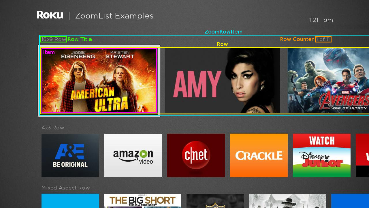
ZoomRowItem's consist of four parts:
- Row Title - This is a built-in Label used to display a title for the row. The string that is displayed comes from the title field of the Row's ContentNode. The Row Title supports turning its display on or off, changing its position relative to the ZoomRowItem's coordinate system and modifying its color and font. This is identified by the green box in the diagram above.
- Row Counter - This is a built-in Label used to display a counter for the row (i.e. 3 of 14). The string that is displayed is automatically generating by the ZoomRowList. In addition to supporting the display attributes listed above for the Row Title, the Row Counter also supports the option of only displaying it when there are enough items in the row to fill up the entire width of the ZoomRowList. By default, the Row Counter is only displayed for the focused row. This is identified by the orange box in the diagram above.
- Row Decoration - Row Decoration refers to an optional custom RSG component that is used to supplement or replace the Row Title and Row Counter displayed by each ZoomRowItem. The Row Decoration supports several fields that can be used to control its appearances, such as the current height of the ZoomRowItem and the current focus percentage of the row. Some examples where this could be useful include:
- Replacing the built-in Row Title with a more complex title that includes both text and icons
- Adding a Bob to the ZoomRowItem that becomes visible as the row enters the focus position and displays details about the currently focused item in the row.
- Row - Row refers to the part of the ZoomRowItem that displays the horizontally scrolling set of Item nodes. Each Item uses a custom RSG component to render the associated data. The Row is identified by the yellow box in the diagram above. An Item is identified by the magenta box in the diagram above.
In some cases, Decoration is used to refer to all the parts of the ZoomRowItem other than the Row (i.e. the Row Title, Row Counter and Row Decoration).
ZoomRowList uses the same data model as RowList nodes. There is a single ContentNode, the root ContentNode, that is assigned to be the content of the entire ZoomRowList. The root ContentNode contains zero or more child ContentNode's that contain the data for each row of the ZoomRowList. These are referred to as row ContentNodes. Each of the row ContentNode's contain zero or more child ContentNode's that contain the data for each item in the row. These are referred to as item ContentNodes.
Layout and Coordinate Systems
Overall Coordinate System and Layout Parameters
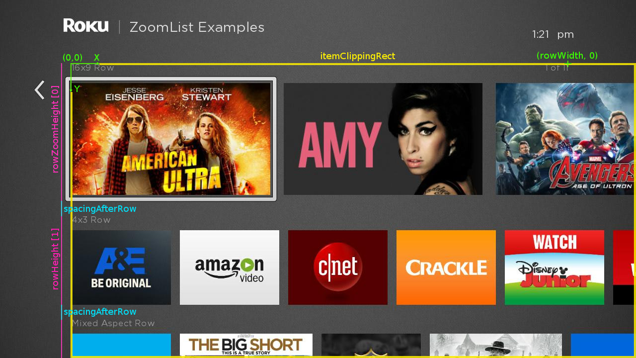
The illustration below shows the overall coordinate system used by the ZoomRowList (the green X-Y axis). The origin of the coordinate system defines the top/left point of the fixed focus location.
The heights of each ZoomRowItem is defined by the rowZoomHeight field if the row is focused and the rowHeight field if the row is not focused. As the row enters or leaves the focus position, the ZoomRowItem's height is smoothly interpolated between the two values. Each ZoomRowItem is separated from the next by the value specified in the spacingAfterRow field, shown in bright blue in the diagram.
The ZoomRowList's itemClippingRect field is used to specify the region where the items in each Row can appear. In this case, the itemClippingRect, shown in yellow in the diagram, is set so that no partial items to the left of ZoomRowList's origin are visible. Generally, setting the itemClippingRect to the smallest value that contains the item's that should be displayed provides optimal performance, so in this case, the width/height of the itemClippingRect is set to the distance between the origin of the ZoomRowList's coordinate system and the right/bottom edge of the screen. Note that the itemClippingRect does not clip the focus feedback indicator.
The rowWidth field specifies the maximum width of items in each Row before the item's wrap. If the total width of the items in the row is less than rowWidth, the focus will float left and right as the user navigates the row. If the total width of the items in the row exceeds rowWidth, the focus will stay fixed on the left and the items will animate left and right as the use navigates the row. In this case, the value of the rowWidth field has also been used to specify the position of the Row Counter.
Zoomed and Unzoomed Row Layout Parameters
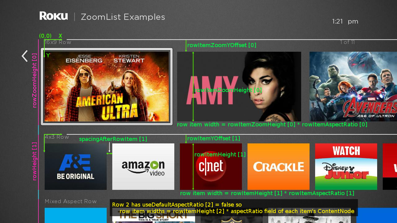
The diagram below shows how the various "rowItem" fields are used to layout zoomed and not zoomed ZoomRowItem's. Each ZoomRowItem has its own coordinate system. The X coordinate of the origin the coordinate system is equal to the X coordinate of the overall ZoomRowList's coordinate system. The Y coordinate of the origin of the each ZoomRowItem's coordinate system is position at the top of each ZoomRowItem. The ZoomRowItem coordinate system is shown as green axes in the diagram.
The focused ZoomRowItem at the top uses the rowItemZoomOffset field to position its Row relative to the top of the ZoomRowItem's coordinate system. Similarly, the rowItemZoomHeight field is used to specify the height of the items in the Row. The width of the items in the Row is computed using the item's height and aspect ratio, which either comes from the rowItemAspectRatio field (if the useDefaultAspectRatio field is true) or from the aspectRatio field of each item's ContentNode if useDefaultAspectRatio is false.
Similarly, the unfocused ZoomRowItem occupying the second row uses the rowItemOffset field to position its Row relative to the top of the ZoomRowItem's coordinate system. Similarly, the rowItemHeight field is used to specify the height of the items in the Row. The aspect ratio is used to compute the width of each item the height as above. The spacingAfterRowItem field is used to specify the horizontal distance between items in the Row. This spacing is zoomed up by the same percentage as the rowHeight as the row gains focus.
In this illustration, there is no custom Row Decoration. The positions of Row Title and the Row Counter are specified relative to the origin of each ZoomRowItem by the rowTitleOffset and the rowCounterOffset fields, respectively. The Row Counter is right-aligned, so its right edge is located at the X coordinate of the rowCounterOffset.
Custom Row Decoration
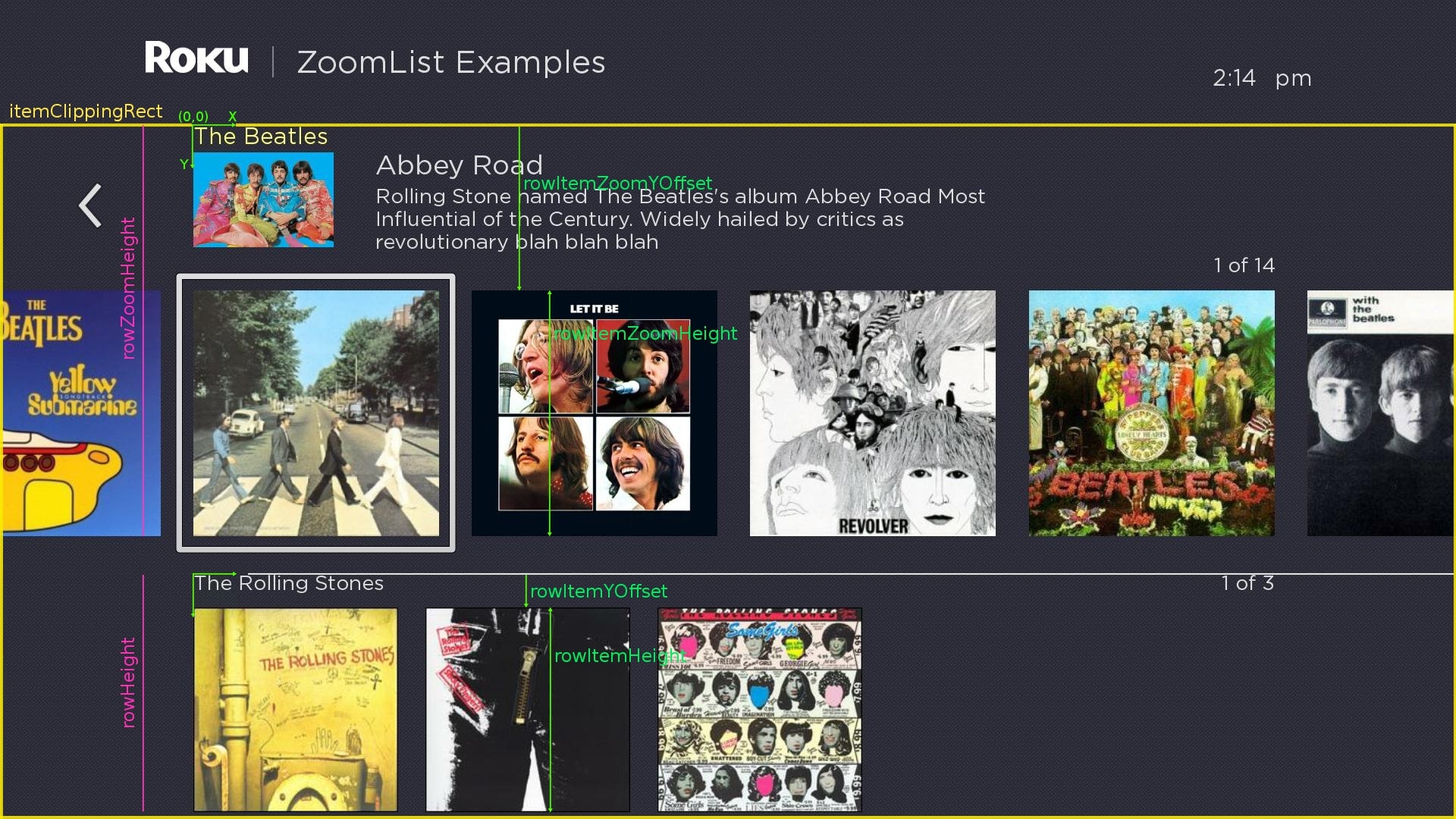
The illustration below is similar to the one above, but in this case, a custom Row Decoration component is used to display album details for the ZoomRowItem in the focused position. Observe in this case that the rowItemZoomYOffset for the zoomed row is much larger than the rowItemYOffset for the un-zoomed row. This causes the space between the top of the ZoomRowItem and it's horizontally scrolling Row of items to increase as the ZoomRowItem gains focus, allowing room for the album details to smoothly transition onscreen to fill that extra space.
Also, notice that the ratio of the focused/unfocused ZoomRowItem's overall height (rowZoom Height/row Height) is significantly larger than the ratio of the focus/unfocused heights of the ZoomRowItem's Row's (rowItemZoomHeight / rowItemHeight). To allow for the extra space occupied by the album details, the Row of items zooms up less than the overall ZoomRowItem does.
Also note that in this case, the itemClippingRect is set to reveal partial items to the left of the origin of the ZoomRowList. Since the first row contains enough items to wrap, the partial items are shown. In the second row, there are not enough items to wrap, so all the items are fully visible and no duplicate partial items are shown.
ZoomRowList Fields
ZoomRowList extends Group so has all the fields of Group as well its parent class Node.
Many ZoomRowList fields have an array of values as their type. Unless otherwise noted, the values in these arrays specify a value for each row in the ZoomRowList's data model. If no values are specified, a default value is used. If there are fewer items in the array than rows in the ZoomRowList's data model, the last value in the array is repeated as needed for the unspecified rows. If there are more items in the array than rows in the ZoomRowList's data model, the extra values are ignored.
One common use case for these array fields is to specify a special value for the first row in the array (a Hero row) and a second value for all other rows. In that case, the field would be set to
[ <Hero Row Value>, <Regular Row Value> ]
so that the Hero Row Value is used for the first row and the Regular Row Value is used for the remaining rows.
This table documents all the fields in ZoomRowList:
| Field | Type | Default | Use |
|---|---|---|---|
| content | ContentNode | invalid | Specifies the content for the list. The content should be a single ContentNode that has one child ContentNode for each row. These child ContentNodes for each row should themselves contains child ContentNodes for each item in the row. See ZoomRowList Data below for more details. |
| itemComponentName | string | "" | Specifies the name of an XML component for the items in each row. An instance of this component is created on demand for each visible item of each row. The XML component must define a specific interface as detailed Item Component Fields below |
| rowWidth | float | 0.0 | This specifies a "safe" width for the row. Currently, it's only used if the displayed width of the zoomed Item's exceeds this width. If that occurs, the items in the row will wrap horizontally. Once full floating focus functionality is added in a subsequent release, this will be used to specify the rightmost limit that the focus can reach as focus floats from left to right. |
| rowHeight | array of float | [ ] | Specifies the height of the ZoomRowItem when the row is not zoomed. Note that this includes the height of the Row and its Decorations. At least one value must be specified. |
| rowZoomHeight | array of float | [ ] | Specifies the height of the ZoomRowItem when the row is zoomed. As the row gains focus, the height of its ZoomRowItem will smoothly change from the row's itemHeight to the row's rowZoomHeight. If no values are specified, none of the rows zoom. |
| spacingAfterRow | float | 0.0 | Specifies the spacing between rows of the ZoomRowList. Note that this spacing value is not scaled by the zoomPercent. |
| itemClippingRect | Rect2D | AA with x, y, width, height set to zero | Specifies a clipping region for the ZoomRowItem's rendered. This provides control over which items are visible. For example, if the left value is set to a negative number, items to the left of the grid's item origin will be visible. For best performance, this should be set so that the itemClippingRect exactly matches what's visible onscreen. If this field is not set, heuristics are used to determine an acceptable clipping rectangle for the items in the ZoomRowList.This field will have the same value as rowFocusPercent unless the remainZoomedAboveFocus field is set to "never" or if the zoomed and un-zoomed height of a row are equal. |
| rowItemYOffset | array of float | [ ] | This specifies the vertical position of the Row relative to the top of its ZoomRowItem when the row is unfocused. Combined with rowZoomYOffset, this allows the vertical position of the ZoomRowItem's Row to smoothly change relative to the top of the ZoomRowItem as the ZoomRowItem gains or loses focus. |
| rowItemZoomYOffset | array of float | [ ] | This specifies the vertical position of the Row relative to the top of its ZoomRowItem when the row is focused (i.e. zoomed). Combined with rowYOffset, this allows the vertical position of the ZoomRowItem's Row to smoothly change relative to the top of the ZoomRowItem as the ZoomRowItem gains or loses focus. |
| rowItemHeight | array of float | [ ] | This specifies the height of each Item in a Row when the row is unfocused. Combined with rowZoomItemHeight, this allows the height of each Item in a Row to be scaled differently than the height of the Row's ZoomRowItem. As the ZoomRowItem gains or loses focus, the height of each Item in the Row smoothly interpolated between the rowItemHeight and rowZoomItemHeight for that row. |
| rowItemZoomHeight | array of float | [ ] | This specifies the height of each Item in a Row when the row is focused (i.e. zoomed). Combined with rowZoomItemHeight, this allows the height of each Item in a Row to be scaled differently than the height of the Row's ZoomRowItem. As the ZoomRowItem gains or loses focus, the height of each Item in the Row smoothly interpolated between the rowItemHeight and rowZoomItemHeight for that row. |
| rowItemAspectRatio | array of float | [ ] | This specifies the aspect ratio of the Items in a Row. This is used to compute the width of the Item's based on the interpolated row item height (see the rowItemHeight and rowZoomItemHeight fields above). If useDefaultAspectRatio is true for that row, then the rowItemAspectRatio value is used to compute the width of each Item in the Row. If false, then if the ContentNode for the Item includes an aspectRatio field, that value is used. This allows different items in a Row to have different aspect ratios. The rowItemAspectRatio values should be a floating point values that represent the ratio of the Item's width to height. For example, if the Item should have a 16 x 9 aspect ratio, this value specified would by 1.7777778 ( = 16 / 9). |
| spacingAfterRowItem | array of float | [ ] | This specifies the horizontal spacing between Items in a Row. When the row is unfocused, this spacing is set to this value. As the row gains focus, this value scales by the same percentage as the row item height increases as it's interpolated between the rowItemHeight and the rowItemZoomHeight for the row. |
| useDefaultAspectRatio | array of Boolean | [ ] | If set to false, rowItemAspectRatio is used to specify the aspect ratio for items in a Row. If set to true and if the ContentNode for an Item in the row includes an aspectRatio field, that value is used instead of the rowItemAspectRatio value. This allows different items in a Row to have different aspect ratios. |
wrap | Boolean | true | If true, the items wrap from bottom to top. If false, the items do not wrap. |
| drawFocusFeedbackOnTop | Boolean | true | If true, the focus feedback indicator is drawn on top of (after) the items. If false, it is drawn below (before) the items. |
| drawFocusFeedback | Boolean | true | If true, the focus feedback indicator is drawn. If false, it is not drawn. |
| fadeFocusFeedbackWhenLongPressScrolling | Boolean | true | If true, when long press scrolling begins, the focus indicator will fade out and reappear when long press scrolling ends. If false, the focus indicator remains visible during long press scrolling. |
| focusBitmapUri | uri | "" | Specifies the bitmap file used for the focus feedback indicator when the ZoomRowList has focus. In most cases, this should be a 9-patch image that specifies both expandable regions as well as margins. Only set this field to specify a custom bitmap that differs in appearance from the default bitmap. |
| focusBitmapBlendColor | color | 0xFFFFFFFF | Blend the graphic image specified by |
| wrapDividerBitmapUri | uri | "" | Specifies the bitmap file to use as a visual separator between the last and first list items when the list wraps. In most case, this should be a 9-patch image that specifies both expandable regions. Only set this field to specify a custom bitmap that differs in appearance from the default bitmap. |
wrapDividerBitmapBlendColor | color | 0xFFFFFFFF | Blend the graphic image specified by wrapDividerBitmapUri with the specified color. If set to the default, 0xFFFFFFFF, no color blending will occur. Set this field to show a focus indicator graphic image with a different color than the image specified by wrapDividerBitmapUri. |
| wrapDividerHeight | float | 0 | Specifies the height of the divider. The wrap divider bitmap will be scaled to this height. This height is also added to the row spacing after the last row to allow more space between the first and last rows when the divider is drawn. |
| wrapDividerWidth | float | 0 | Specifies the width of the divider. The wrap divider bitmap will be scaled to this width. If not specified, the width is set to the value of the rowWidth field. |
| wrapDividerOffset | Vector2D | 0 | By default, the wrap divider is drawn with its X-position set to 0 in the ZoomRowList's coordinate system and vertically centered in the space between the first and last rows (This space equals the spacing after the last row plus the row divider height). This field allows the position of the wrap divider to be adjusted relative to its default position. |
| showRowTitle | array of Boolean | [ ] | Specifies whether the row title displayed. NOTE: RowList has an identical field named "showRowLabel". The name was changed to "showRowTitle" for the ZoomRowList to indicate that the text for the label comes from the Row ContentNode's title field. |
| rowTitleOffset | array of Vector2D | [ ] | Specifies the offset of the Row Title for each row. The x-coordinate specifies the horizontal offset of the label from the left edge of the row. The y-coordinate specifies the vertical spacing of the top of the Row Title from the top of the row's coordinate system. If the array specified contains no values, a default offset value of [0,0] is used. |
| rowTitleFont | Font | invalid | Specifies the font for the Row Title's text. NOTE: RowList has an identical field named "rowLabelFont" (see showRowTitle's description above for more details). |
| rowTitleColor | array of color | [ ] | Specifies the color of the Row Title's text. NOTE: RowList has an identical field named "rowLabelColor" (see showRowTitle's description above for more details). |
| showRowCounter | array of Boolean | [ ] | Specifies whether each row's Row Counter is displayed. Note that the Row Counter is displayed for the focused row even if the |
| rowCounterOffset | array of Vector2D | [ ] | Specifies the offset of the Row Counter for each row. The x-coordinate specifies the horizontal offset of the label from the left edge of the row. The y-coordinate specifies the vertical spacing of the top of the Row Counter from the top of the row's coordinate system. If the array contains fewer elements than the number of rows in the data model, the last value in the array is used as the offset for the labels of the extra rows. If the array specified contains no values, a default offset value of Note that the Row Counter is right-aligned, so the x-coordinate of its rowCounterOffset is used to position the right edge of the Row Counter's Label node. |
| rowCounterFont | Font | invalid | Specifies the font for the Row Counter's text. NOTE: RowList did not allow a different font for the Row Counter to be used. It always used the same font as the Row Title. |
rowCounterColor | array of color | [ ] | Specifies the font for the Row Counter's text. NOTE: RowList did not allow a different color for the Row Counter to be used. It always used the same color as the Row Title. |
| showRowCounterForShortRows | Boolean | true | When set to true, the Row Counter is shown for all rows. When set to false, the Row Counter is not shown if the total zoomed width of the items in the room is less than the value of the |
rowDecorationComponentName | string | "" | Specifies the name of an XML component to decorate each row. An instance of this component is created on demand for each visible item of each row. The XML component must define a specific interface as detailed Row Decoration Component Fields below |
| rowSelected | integer | -1 | Read-Only When an item is selected, set to the index of the selected row. NOTE: RowList has an identical field named "itemSelected". This new name better reflects the field's purpose. |
| rowFocused | integer | -1 | Read-Only When a row gains the key focus, set to the index of the focused row. NOTE: RowList has an identical field named "itemFocused". This new name better reflects the field's purpose. |
| rowUnfocused | integer | -1 | Read-Only When a row loses the key focus, set to the index of the unfocused row. NOTE: RowList has an identical field named "itemUnfocused". This new name better reflects the field's purpose. |
| rowItemSelected | array of integer | [ ] | Read-Only When an item is selected, set to a 2-element array, where element 0 contains the index of the row containing the selected item, and element 1 contains the index of the selected item in that row. |
| rowItemFocused | array of integer | [ ] | Read-Only When an item gains the key focus, set to a 2-element array, where element 0 contains the index of the focused row, and element 1 contains the index of the focused item in that row. |
| scrollingStatus | Boolean | false | Read-Only Set to true whenever the ZoomRowList is scrolling the focus horizontally or vertically. |
| rowsRendered | array of integer | [ ] | Read-Only Contains a pair of indices that indicate the first and last Row ContentNode's that were rendered during the previous render. It is set at the end of each render. For example, if rows 2, 3 and 4 were rendered, the field is set to Note if the rows have wrapped vertically, the first value will be less than the second. So if there are 7 Row ContentNode's and itemsRendered is set to [ 6, 1] that indicates that Row ContentNode's 6, 0 and 1 were rendered. |
| rowItemsRendered | array of integer | [ ] | Read-Only Contains an array of values that indicate what Row ContentNode's and what Item ContentNode's were rendered during the previous render. It is set at the end of each render. The values in the arrays are triples of integers with each triple containing the index of the Row ContentNode, followed by the first and last index of the Item ContentNode's in that row that was rendered. For example if rowItemsRender is set to [ 0, 4, 7, 1, 0, 2, 2, 0, 3 ] that indicates that Item ContentNode children 4 to 7 of Row ContentNode 0 were rendered, Item ContentNode children 0 to 2 of Row ContentNode 1 were rendered and Item ContentNode children 0 to 3 of Row ContentNode 2 were rendered. The triples will appear in the order in which the rows were rendered and will contain one triple of values for each rendered row. If the Item's in a row have wrapped horizontally, the first item index for that row will be greater than the second. For example, if row 3 has 8 Item ContentNode's and rowItemsRendered is set to [ 3, 6, 2], that indicates that Item ContentNode's 6, 7, 0, 1 and 2 of row 3 were rendered. |
| currFocusRow | float | -1.0 | Read-Only Set to the index of the row that currently overlaps the ZoomRowList's fixed focus position (i.e. y=0 in the ZoomRowList's coordinate system). Let's refer to that position as yFocusTop. The value is a floating point value where the integer part represents the row that overlaps yFocusTOp and the fractional part represents the percentage of the item that overlaps the fixed focus position. For example, a value of 2.3 indicates that the focus is 30% of the way between row's 2 and 3. If currFocusRow is greater than the number of rows' in the content minus 1, that indicates that the focus is between the last row and the first row. For example, if the ZoomRowList's content has 8 rows, currFocusRow = 7.65 would indicate that the focus is 65% of the way between row 7 and row 0. |
| jumpToRow | integer | -1 | Write-Only When set to a valid item index, causes the list to immediately update so that the specified row moves into the focus position. NOTE: RowList has an identical field named "jumpToItem". This new name better reflects the field's purpose. |
| jumpToRowItem | array of integer | [ ] | Write-Only When set to a valid [ row, col ] index pair, causes the list to immediately update so that the specified row, col item moves into the focus position. |
| animateToRow | integer | -1 | Write-Only When set to a valid item index, causes the list to quickly scroll so that the specified row moves into the focus position. NOTE: RowList has an identical field named "animateToItem". This new name better reflects the field's purpose. |
remainZoomedAboveFocus
| string | focusIsAtTop | This field controls whether the rows that appear above the focus row are shown in their zoomed size or un-zoomed size as they move in/out of the focus position. If set to "focusIsAtTop" and the ZoomRowList's itemClippingRect's top is set 0.0, then rows will remain at their zoomed size as they enter/exit the focus region from above. The UX team has decided that this looks better as it minimizes the number of items simultaneously changing sizes as the user scrolls vertically. If set to "never", then rows will zoom up/down as they enter/exit the focus region from above. If set to "always", then rows will always remain at their zoomed size as they enter/exit the focus region from above regardless of the itemClippingRect's top value. |
fadeOutAboveFocus
| string | focusIsAtTop | This field controls whether the rows that appear above the focus row fade in/out as they move in/out of the focus position. If set to "focusIsAtTop" and the ZoomRowList's itemClippingRect's top is set 0.0, then rows will fade in/out as they enter/exit the focus region from above. If set to "never", then rows will not fade in/out as they enter/exit the focus region from above. If set to "always", then rows will always fade in/out as they enter/exit the focus region from above regardless of the itemClippingRect's top value. |
ZoomRowList Data Model
A ZoomRowList node should have a single ContentNode node as the root node stored in its content field. One child ContentNode should be added to the root node for each row in the list (these nodes can be thought of as row nodes). Each row node should contain one child ContentNode for each item in the row (these nodes can be thought of as item nodes).
Row ContentNode Data Bindings
Attribute | Type | Description |
|---|---|---|
| title | string | This is used as the string display in the Row Title |
Item ContentNode Data Bindings
Attribute | Type | Description |
|---|---|---|
| aspectRatio | float | This specifies the aspectRatio for the item. It is used to compute the width from the interpolated row item height for row's where the useDefaultAspectRatio is set to false. The value should be a floating point value representing the ratio of the Item's width to height. For example, if the Item should have a 16 x 9 aspect ratio, this value specified would by 1.7777778 ( = 16/9). |
Item Component Fields
Each Item in the ZoomRowList is rendered using a custom XML component specified by the itemComponentName field value. An instance of this component is created for each visible Item in each Row of the ZoomRowList.
If the XML component contains interface fields that match the names shown in the table below, those fields will be updated by the ZoomRoowList node. This allows the XML component to dynamically alter the item's appearance by observing changes to these interface fields.
Note that the fields are updated in the order presented in the table below. Most notably, when the itemContent field is set initially, the other fields will have valid values. This allows the script to be made more efficient by delaying computations until the itemContent field is set in some cases.
Field Name | Field Type | Description |
|---|---|---|
| width | float | Read-Only Note this is computed from the interpolated row item height scaled by the item's aspect ratio. The aspect ratio comes from either the rowItemAspectRatio field (if useDefaultAspectRatio for the row if true) or from the Item's ContentNode (if useDefaultAspectRatio for the row is false). |
| height | float | Read-Only Note this is computed by interpolating the rowItemHeight and rowZoomItemHeight field values for the row. |
| index | integer | Read-Only Set to the index of the Item ContentNode in the row's Row ContentNode associated with this item. For example, if the index is set to 2, that indicates that this item is associated with child 2 of the Row's ContentNode. Note that the index of the RowContent node is available via the rowIndex field. |
| rowIndex | integer | Read-Only Set to the index of the Row ContentNode associated with this item. For example, if the index is set to 2, that indicates that this Item is part of row 2. |
| itemHasFocus | Boolean | Read-Only Indicates whether the Item is currently the RowList's focused item. When scrolling starts, the itemHasFocus field for the currently focused Item is set to false. When scrolling ends, the itemHasFocus field for the newly focused Item is set to true. During the scrolling animation, all itemHasFocus fields are set to false. Only one Item's of the ZoomRowList will ever have itemHasFocus set to true. If the ZoomRowList does not have focus, all itemHasFocus fields of all Item's will be set to false. |
| rowHasFocus | Boolean | Read-Only Only the Item's in one Row of the ZoomRowList will ever have rowHasFocus set to true. If the ZoomRowList does not have focus, all rowHasFocus fields of all Item's will be set to false. |
| rowListHasFocus | Boolean | Read-Only Set to true if the ZoomRowList that contains this Item has focus, false otherwise. The rowListHasFocus field of all Item's of the ZoomRowList will always have the same value. |
| itemContent | ContentNode | Read-Only Contains the data to be displayed by the row list item. The relationship between data in the ContentNode node and the visual elements of the row list item is determined by the markup and scripts' of the item's XML component. Typically, an observer callback function of the |
| focusPercent | float | Read-Only A fractional value that smoothly changes from 0.0 to 1.0 as the Item gains focus and from 1.0 to 0.0 as the item loses focus. This value is typically used in the item's XML component to smoothly change some aspect of the Item's appearance as it moves horizontally in and out of the focus position. |
| rowFocusPercent | float | Read-Only A fractional value that smoothly changes from 0.0 to 1.0 as the Item's Row gains focus and from 1.0 to 0.0 as the Item's Row loses focus. This value is typically used in the item's XML component to smoothly change some aspect of the Item's appearance as it's Row moves vertically in and out of the focus position. |
| rowHeightPercent | float | Read-Only This field will have the same value as rowFocusPercent unless the remainZoomedAboveFocus field is set to "never" or if the zoomed and un-zoomed height of a row are equal. |
| Additional optional item component fields will likely be added after 8.1 (scrollingStatus, etc.) |
Row Decoration Component Fields
If a RowDecorationComponentName is specified, an instance of this component is created as a child of each visible row's ZoomRowItem.
If the XML component contains interface fields that match the names shown in the table below, those fields will be updated by the ZoomRoowList node. This allows the XML component to dynamically alter the row decoration's appearance by observing changes to these interface fields.
Note that the fields are updated in the order presented in the table below. Most notably, when the itemContent field is set initially, the other fields will have valid values. This allows the script to be made more efficient by delaying computations until the itemContent field is set in some cases.
Field Name | Field Type | Description |
|---|---|---|
| width | float | Read-Only |
| height | float | Read-Only |
| rowFocused | integer | Read-Only Set to the index of the currently focused Item when the ZoomRowList's rowFocused field is set. |
| rowCounterText | string | Read-Only |
| rowContent | ContentNode | Read-Only Contains the ContentNode associated with the Row. |
| rowFocusPercent | float | Read-Only A fractional value that smoothly changes from 0.0 to 1.0 as the Item's Row gains focus and from 1.0 to 0.0 as the Item's Row loses focus. This value is typically used in the item's XML component to smoothly change some aspect of the Item's appearance as it's Row moves vertically in and out of the focus position. |
| rowHeightPercent | float | Read-Only This field will have the same value as rowFocusPercent unless the remainZoomedAboveFocus field is set to "never" or if the zoomed and unzoomed height of a row are equal. |
Attachments:
 partsLabelled.jpg (image/jpeg)
overallCoordinateSystem.jpg (image/jpeg)
rowLayout.jpg (image/jpeg)
rowDecorationLayout.jpg (image/jpeg)
partsLabelled.jpg (image/jpeg)
overallCoordinateSystem.jpg (image/jpeg)
rowLayout.jpg (image/jpeg)
rowDecorationLayout.jpg (image/jpeg)