Table of Contents
Sliding panels are a new user interface element in the SceneGraph API. Sliding panels allow the creation of sets of other elements, such as lists or grids, that are grouped into panels that can be moved left and right on and off the display screen. The panels can also be created (and removed) dynamically in response to user input and program behavior.
Sliding Panel Nodes
The following are the panel node classes supplied by Roku as part of the SceneGraph API:
Panel Nodes, Panel Sets, and Panel Set Scenes
The Panel, ListPanel, and GridPanel node classes are the panel node classes that can be extended to create a custom panel component design in XML markup. The Panel node class is a generic panel node that can include any type of content, while the ListPanel and GridPanel node classes are specifically intended to contain list or grid content respectively, with special features that can automatically create new panels based on item selection in the panel list or grid.
These panel node classes are designed to be used as part of a panel set. Panel sets are groups of child panel nodes that can be dynamically created and moved into view automatically after being created. The PanelSet node class is the parent node class of the child panel nodes in the panel set.
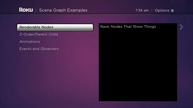
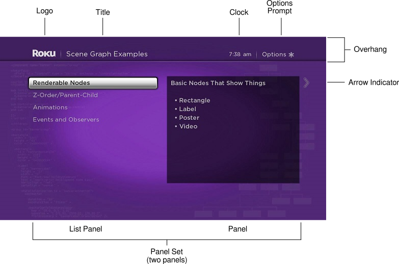
A special Scene node class is provided for panel sets: OverhangPanelSetScene. The OverhangPanelSetScene node class by default includes a child Overhang node, and a child PanelSet node. The Overhang node class provides a region at the top of the screen that is the full width of the screen, with default poster and label elements that can be automatically targeted with content by the focused panel in the PanelSet node. As part of an OverhangPanelSetScene scene, the child PanelSet node is automatically positioned below the Overhang node. The PanelSet node class includes areas on the left and right side of the panel set designed for automatic arrow indicators, to prompt the user to press the Right, Left, or Back keys to select and slide the panels.

Panel Adding/Sliding
As part of a panel set, panel node classes are designed to automatically slide into and out of view in response to being added to the panel set as a result of user input or other program behavior. To allow this automatic adding/sliding behavior, panel node classes have a set of default width sizes based on the width of the panel set, excluding the arrow indicators on the sides of the panel set. The panelSize field for panel node classes should be set to one of four width sizes:
| Size | Description |
|---|---|
| narrow | Approximately a third of the panel set width |
| medium | Approximately one half the panel set width |
| wide | Approximately two-thirds of the panel set width |
| full | Approximately the full panel set width |
The precise horizontal positioning of panels in the panel set depends on the screen resolution, as well as the setting of the leftPosition field of the panel node. The leftPosition field determines the offset from the left side of the panel set for a panel, but has default settings based on screen resolution that generally should not be changed. The actual pixel sizes and left position of the panels is as follows:
| Panel Field | Panel Size | SD Value | HD Value |
|---|---|---|---|
| height | all | 403 | 605 |
| width | narrow | 218 | 388 |
| medium | 292 | 520 | |
| wide | 363 | 645 | |
| full | 520 | 940 | |
| leftPosition | narrow | 60 | 105 |
| medium | 60 | 105 | |
| wide | 63 | 112 | |
| full | 100 | 170 |
The width size you choose for each panel should be determined by the size of the content of the panel, and the size of adjacent panels to the left and right. When a panel is added that can only be displayed by sliding an existing panel (or panels) to the left, the PanelSet node class will automatically slide the existing panel or panels to the left. So the simplest method to set up this automatic sliding of the panels as needed is to select the default panel width sizes that fill the panel set width at all times.
To do this, you should pair adjacent panels based on their width size. For example, two medium panels that are added as the first two panels on the left could be paired with full panel to be created on the right, with the isFullScreen field set to true, which configures the panel to be the only panel to be shown. Then when the full right panel is added, the two medium panels slide automatically off the screen to the left, and the full right panel slides into view from the right. Alternately, you could pair a narrow and a wide panel on the left with a full panel on the right. In some cases, you might want to create tombstone panels with additional information on focused items in a panel to the left to fill the panel set width.
After setting up the panels in the panel set according to size and content, the panels will slide back and forth automatically based on user Right, Left, and Back key presses, adding new panels to the panel set, and putting the focus on already-added panels. You add new panels as children of the panel set using the createChild() function, or using the createObject() function followed by the appendChild() function, depending on the sequence your application will follow to slide the panels, because the panels will not slide until added to the panel set.
Sliding Panels Example
Example Application: SlidingPanels.zip
The following adds two medium panels as children of a panel set in an OverhangPanelSetScene component init() function, and sets up field observers with callback functions to populate and add panels to the right, and slide the panels back and forth based on user key presses.
sub init()
  m.top.backgroundURI = "pkg:/images/rsgetbg.jpg"

  m.top.overhang.showClock = false
  m.top.overhang.showOptions = true

  m.categoriespanel = m.top.panelSet.createChild("categoriesListPanel")

  m.categoryinfopanel = m.top.panelset.createChild("categoryinfoPanel")

  m.categoriespanel.list.observeField("itemFocused","showcategoryinfo")
  m.categoryinfopanel.observeField("focusedChild","slideexamplesgridpanel")

  m.categoriespanel.setFocus(true)
end sub

sub showcategoryinfo()
  categorycontent = m.categoriespanel.list.content.getChild(m.categoriespanel.list.itemFocused)
  m.categoryinfopanel.description = categorycontent.description
  m.examplespanel = createObject("RoSGNode","examplesGridPanel")
  m.examplespanel.overhangtext = categorycontent.shortdescriptionline1
  m.examplespanel.gridcontenturi = categorycontent.Url
end sub

sub slideexamplesgridpanel()
  if not m.top.panelSet.isGoingBack
    m.top.panelSet.appendChild(m.examplespanel)
    m.examplespanel.setFocus(true)
  else
    m.categoriespanel.setFocus(true)
  end if
end sub
The categoriesListPanel component object created as a child of the panel set was defined as a medium panel in its component XML file, and the same was done for the categoryinfoPanel component. For example, the categoriesListPanel component was defined as follows:
<component name="categoriesListPanel" extends="ListPanel" >
<script type="text/brightscript" >
<![CDATA[
sub init()
m.top.panelSize = "medium"
m.top.focusable = true
m.top.hasNextPanel = true
m.top.leftOnly = true
m.top.createNextPanelOnItemFocus = false
m.top.selectButtonMovesPanelForward = true
m.top.overhangTitle = "SceneGraph Examples"
m.categorieslist = m.top.findNode("categorieslist")
m.top.list = m.categorieslist
end sub
]]>
</script>
<children>
<LabelList id = "categorieslist" >
<ContentNode role = "content" >
<ContentNode
title = "Renderable Nodes"
description = "Basic Nodes That Show Things


 • Rectangle

 • Label

 • Poster

 • Video"
shortdescriptionline1="Renderable Node Markup"
Url = "http://www.sdktestinglab.com/renderablegrid.xml" />
<ContentNode
title = "Z-Order/Parent-Child"
description = "SceneGraph Tree Order Matters


Demonstrates the basic concepts of SceneGraph element layering
and inheritance. In Roku SceneGraph, what's on the bottom of your XML tree goes
on top!"
shortdescriptionline1="Z-Order/Parent-Child Markup"
Url = "http://www.sdktestinglab.com/zordergrid.xml" />
<ContentNode title = "Animations"
description = "Fly Things Around and Flash Lights


This shows you how to make your application more moving, by animating
screen elements. There are examples for all of the field interpolator nodes, plus
sequential and parallel animations."
shortdescriptionline1="Animation Markup"
Url = "http://www.sdktestinglab.com/animationgrid.xml" />
<ContentNode title = "Events and Observers"
description = "React When Stuff Happens


You need to handle events that come from both the user, and program
actions. You'll learn to use the onKeyEvent() and observeField() SceneGraph
functions to do this."
shortdescriptionline1="Events and Observers Markup"
Url = "http://www.sdktestinglab.com/eventsobserversgrid.xml" />
</ContentNode>
</LabelList>
</children>
</component>
Since both the categoriesListPanel and categoryinfoPanel components were defined as medium panels (each approximately one-half the panel set width), they fill the entire panel set width. The categoryinfoPanel component is defined as a simple tombstone panel to be targeted with additional information on the focused item in the categoriesListPanel component list on the left. It implements an <interface> element with an onChange callback function attribute for a string field:
<component name="categoryinfoPanel" extends="Panel" >

<interface>
  <field id = "description" type = "string" onChange = "showdescription" />
</interface>

<script type="text/brightscript" >
<![CDATA[

sub init()
  m.top.panelSize = "medium"
  m.top.focusable = true
  m.top.hasNextPanel = true

  m.infolabel = m.top.findNode("infoLabel")
end sub

sub showdescription()
  m.infolabel.text = m.top.description
end sub

]]>
</script>

<children>

<Rectangle
  id = "infoRectangle"
  translation = "[0,40]"
  height = "420"
  width = "520"
  color = "0x00000099" >

  <Label
    id = "infoLabel"
    translation = "[15,15]"
    height = "595"
    width = "510"
    font = "font:MediumBoldSystemFont"   />

</Rectangle>

</children>

</component>
So when a user focuses on an item in the m.categoriespanel component list, the showcategoryinfo() callback function triggered by the itemFocused field change targets the m.categoryinfopanel panel object with content for that item, and creates an examplesGridPanel component object, a full width GridPanel node panel to the right. Because the m.examplespanel panel object is created using createObject(), but not yet added to the panel set, the panels do not slide. The sliding is performed by the focusedChild field observer callback function slideexamplesgridpanel() when focus moves to the m.categoryinfopanel panel object in automatic response to user Right, Left, and Back key presses. The callback function moves the focus to either the left-hand m.categoriespanel panel object, or the full width right-hand m.examplespanel object, depending on the direction of the key press indicated by the panel set isGoingBack field, automatically sliding the panels in response to the focus change.
The full width examplesGridPanel component was defined as follows, setting the isFullScreen field to true to automatically slide the panel when added to the panel set and focused:
<component name="examplesGridPanel" extends="GridPanel" >

<interface>
  <field id = "overhangtext" type = "string" />
  <field id = "gridcontenturi" type = "string" onChange = "readpostergrid" />
</interface>

<script type="text/brightscript" >
<![CDATA[

sub init()
  m.top.panelSize = "full"
  m.top.isFullScreen = true
  m.top.focusable = true
  m.top.hasNextPanel = false
  m.top.createNextPanelOnItemFocus = false
  m.top.optionsAvailable = true
  m.top.grid = m.top.findNode("examplesPosterGrid")
end sub

sub readpostergrid()
  m.readPosterGridTask = createObject("roSGNode","postergridCR")
  m.readPosterGridTask.postergriduri = m.top.gridcontenturi
  m.readPosterGridTask.observeField("postergridcontent","showpostergrid")
  m.readPosterGridTask.control = "RUN"
end sub

sub showpostergrid()
  m.top.grid.content = m.readPosterGridTask.postergridcontent
  m.top.overhangTitle = m.top.overhangtext
end sub

]]>
</script>

<children>

<PosterGrid
  id = "examplesPosterGrid"
  basePosterSize = "[520,296]"
  caption1NumLines = "1"
  numColumns = "2"
  numRows = "5"
  itemSpacing = "[15,15]" />

</children>

</component>
Attachments:
 overhangpanelsetscene.jpg (image/jpeg)
 overhangpanelsetscene.jpg (image/jpeg)
 panelset.png (image/png)
 panelset.png (image/png)
 panelset.png (image/png)
 panelset.png (image/png)
 SlidingPanels.zip (application/zip)
panelset.png (image/png)
SlidingPanels.zip (application/zip)
panelset.png (image/png)
 panelset.png (image/png)
 panelset.png (image/png)
 panelset11testxcf.jpg (image/jpeg)