Example Applications: LabelListExample.zip, LabelListFocusStyleExample.zip, LabelListFocusFontExample.zip
Node Class Reference: LabelList
The LabelList node class shows a list of selectable string items arranged vertically, with several formatting and display options. The strings for the LabelList node must be set in a ContentNode node, with the string for each item set as Content Meta-Data title attribute in a child ContentNode node. The ContentNode node object is set as the value of the LabelList node content field to configure and display the list. Each item can be focused by pressing the Up and Down remote keys, and an item can be selected by pressing the OKkey.
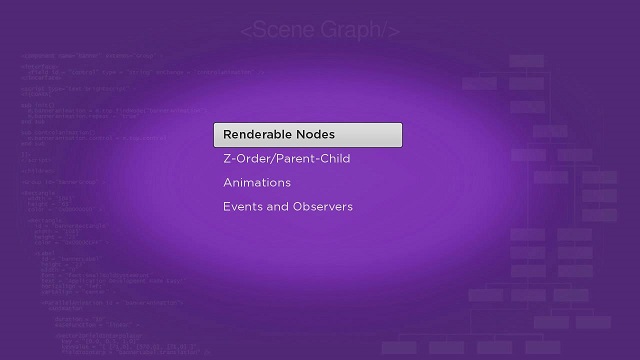
LabelListExample.zip shows the simplest default configuration possible. The LabelList node is created in the <children> element of the labellistscene.xml file as seen in the following example:
<children >
  <LabelList id = "exampleLabelList" >
    <ContentNode role = "content" >
      <ContentNode title = "Renderable Nodes" />
      <ContentNode title = "Z-Order/Parent-Child" />
      <ContentNode title = "Animations" />
      <ContentNode title = "Events and Observers" />
    </ContentNode>
  </LabelList>
</children>
The example uses the XML role attribute of the ContentNode node defined as a child of the LabelList node, to assign the ContentNode node to the content field of the LabelListnode. The result is as follows, with the currently-focused item identified by a focus indicator graphic under the item string in an inverse font color:
In most cases, the ContentNode node for the LabelList node will be downloaded as Content Meta-Data attributes for the list items from an XML or JSON (or equivalent) file from your server, then converted to a ContentNode node by your application. Note that you can include as many Content Meta-Data attributes in the ContentNode node for your LabelList node as you have available on your server and database, but only the title attribute is actually used for configuration of the list. The extra attributes can be used in other parts of your application as described later in this tutorial, for additional information to allow the user to select an item, and for media playback configuration for video-on-demand applications. The purpose of the LabelList node is to allow user to focus and select an item, and then have the application be able to use all the Content Meta-Data attributes for the item.
In a complete application, you will set observers on the LabelList node itemFocused and itemSelected fields, to trigger callback functions that perform operations related to the item focus and select events. You'll see how to do this later in this tutorial.
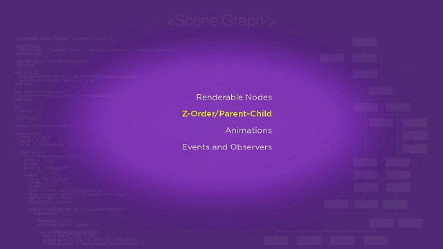
The LabelList node has several appearance and configuration options available. LabelListFocusStyleExample.zip sets a few custom field values to change the text alignment, focused color, and focus style of the list:
| Custom Field Name | Set To | Result from Custom Setting |
|---|---|---|
vertFocusAnimationStyle | floatingFocus | Changes how focus moves up and down the list, and what happens when the end or top of the list is reached |
drawFocusFeedback | false | Does not display the default focus indicator graphic |
focusedColor | 0xEBEB10FF | Changes the focused text color from the default inverse color |
textHorizAlign | right | Aligns the right edges of the item strings rather than the default left alignment |
From the above Custom Fields and Settings, we derive the following code sample:
<LabelList
  id = "exampleLabelList"
  vertFocusAnimationStyle = "floatingFocus"
  drawFocusFeedback = "false"
  focusedColor = "0xEBEB10FF"
  textHorizAlign = "right" >
  ...
</LabelList>
And the result is:
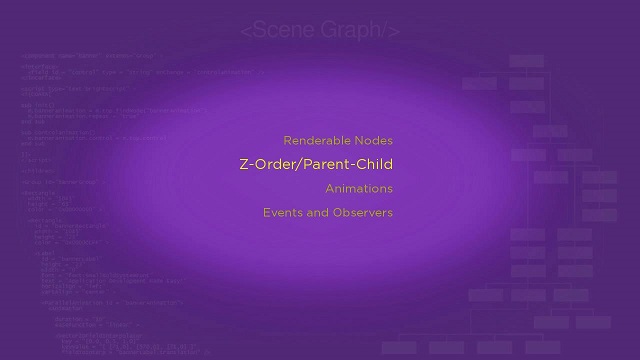
LabelListFocusFontExample.zip is another example of a custom LabelList node configuration. This example sets the same values as the previous example for the textHorizAlign, vertFocusAnimationStyle, drawFocusFeedback, and focusedColor fields. But the example changes the default unfocused text color by setting the colorfield value to 0xAAAA10FF:
<LabelList
  id = "exampleLabelList"
  vertFocusAnimationStyle = "floatingFocus"
  drawFocusFeedback = "false"
  color = "0xAAAA10FF"
  focusedColor = "0xEBEB10FF"
  textHorizAlign = "right" >
  ...
</LabelList>
But then the example configures the focused item to have a font size five points larger than the unfocused items. This has to be done in the <script> element init() function of labellistfocusfontscene.xml:
<script >
  <![CDATA[
  sub init()
    ...
    example = m.top.findNode("exampleLabelList")
    ...
    example.font = "font:MediumSystemFont"
    example.focusedFont = "font:MediumSystemFont"
    example.focusedFont.size = labellist.font.size+5
    ...
  end sub
  ]]>
</script>
And the result is:
Attachments:
 labellistdoc.jpg (image/jpeg)
labellistfocusstyledoc.jpg (image/jpeg)
labellistfocusfontdoc.jpg (image/jpeg)
labellistdoc.jpg (image/jpeg)
labellistfocusstyledoc.jpg (image/jpeg)
labellistfocusfontdoc.jpg (image/jpeg)