Table of Contents
Extends:
Also See Related Page:
List and Grids Markup - LabelList Markup
Description
The LabelList node class is a simple list class that can be used to display a list of items. Each item can include a text string and an optional icon positioned to the left of the text string.
The list items can be organized into sections that are demarcated by labelled horizontal divider lines between the sections.
In most cases, you will want to populate the content of a LabelList (or other similar components like PosterGrids, etc.) from a content feed, web service API, or some other dynamic data source. However, to illustrate the basics of how a LabelList is constructed and used, here is a simple example of creating a LabelList and populating it with static data. Static data in a LabelList may be useful for channel screens such as settings or menus with fixed items.
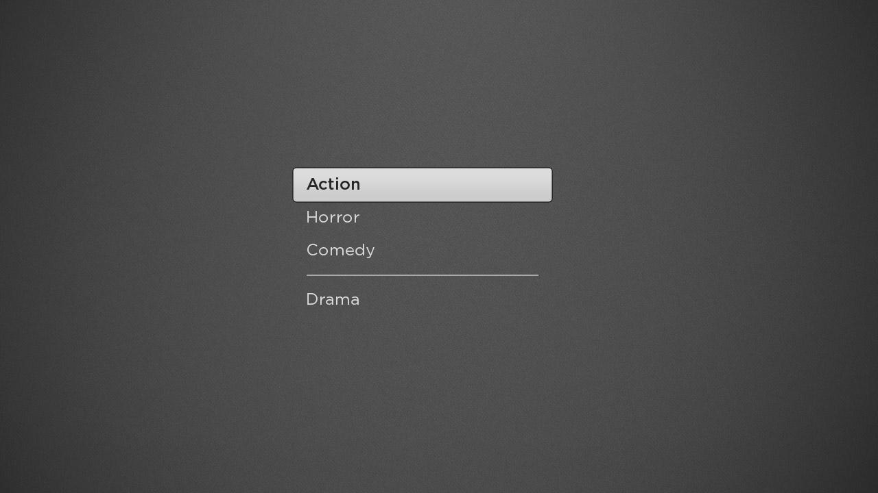
<LabelList
  id = "moviemenu"
  translation = "[160,92]"
  itemSize = "[440,48]" >

  <ContentNode id = "moviemenucontent" role = "content" >

	<ContentNode title = "Drama" />
	<ContentNode title = "Action" />
    <ContentNode title = "Horror" />
    <ContentNode title = "Comedy" />

  </ContentNode>

</LabelList>
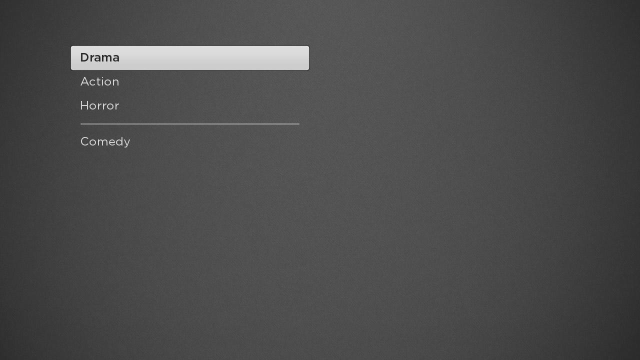
Example
This code renders the LabelList shown below.
In this screen shot, the user has scrolled down one item to highlight "Drama" showing the separator after the last list item.
Fields
| Field | Type | Default | Use | ||||||||
|---|---|---|---|---|---|---|---|---|---|---|---|
| content | ContentNode | none | Specifies the content for the list. See Data Bindings below for more details. If the data contains section markers, section dividers will be drawn between each section. These section dividers may contain an icon and/or a string. | ||||||||
| itemSize | vector2d | [0,0] | Specifies the width and height of each item in the list | ||||||||
| itemSpacing | vector2d | [0,0] | The second value of the vector specifies the vertical spacing between items in the list. The first value of the vector is ignored. | ||||||||
| numRows | integer | 12 | Specifies the number of visible rows displayed. The actual number of rows may be more or less than the number of visible rows specified depending on the number of items in the list content. | ||||||||
| textHorizAlign | option string | left | Specifies the horizontal alignment of the text in the list item area specified by the
| ||||||||
| color | color | 0xddddddff | Specifies the text color for unfocused list items | ||||||||
| focusedColor | color | 0x262626ff | Specifies the text color for focused list items | ||||||||
| font | font | system default | Specifies the font for unfocused list items | ||||||||
| focusedFont | font | system default | Specifies the font for focused list items | ||||||||
| drawFocusFeedback | Boolean | true | Specifies whether or not the focus indicator bitmap is displayed | ||||||||
| drawFocusFeedbackOnTop | Boolean | false | Specifies whether the focus indicator bitmap is drawn below or on top of the list items | ||||||||
| vertFocusAnimationStyle | string | fixedFocusWrap | Specifies the how the focus indicator moves in a list of items in response to the remote direction pad Up and Down key presses. The possible values are:
| ||||||||
| focusRow | integer | 0 | Specifies the row that will have fixed focus if the vertFocusAnimationStyle field value is set to fixedFocusWrap. | ||||||||
| focusBitmapUri | uri | "" | Specifies the bitmap file used for the focus indicator when the list has focus. In most cases, this should be a 9-patch image that specifies both expandable regions as well as margins. Only set this field to specify a custom bitmap that differs in appearance from the default bitmap. | ||||||||
| focusFootprintBitmapUri | uri | "" | Specifies the bitmap file used for the focus indicator when the list does not have focus. In most cases, this should be a 9-patch image that specifies both expandable regions as well as margins. Only set this field to specify a custom bitmap that differs in appearance from the default bitmap. | ||||||||
| focusBitmapBlendColor | color | 0xFFFFFFFF | Blend the graphic image specified by focusBitmapUri with the specified color. If set to the default, 0xFFFFFFFF, no color blending will occur. Set this field to show a focus indicator graphic image with a different color than the image specified by focusBitmapUri. | ||||||||
| focusFootprintBlendColor | color | 0xFFFFFFFF | Blend the graphic image specified by focusFootprintBitmapUri with the specified color. If set to the default, 0xFFFFFFFF, no color blending will occur. Set this field to show a focus footprint indicator graphic image with a different color than the image specified by focusFootprintBitmapUri. | ||||||||
| wrapDividerBitmapUri | uri | "" | Specifies the bitmap file to use as a wrap divider, the visual separator between the last and first list items when the list wraps. In most cases, this should be a 9-patch image that specifies both expandable regions. Only set this field to specify a custom bitmap that differs in appearance from the default bitmap. | ||||||||
| wrapDividerHeight | float | 0.0 | Specifies the height of the wrap divider, the visual separator between the last and first list items when the list wraps. The bitmap for the wrap divider is scaled to this height. The width of the wrap divider is set to the width of the list items as specified by the | ||||||||
| sectionDividerBitmapUri | uri | "" | Specifies the bitmap file to use as visual separator between sections of the list. The section dividers can include an icon and a label in addition to the section divider bitmap. Only set this field to specify a custom bitmap that differs in appearance from the default bitmap. For sections that do not contain an icon or a title, the bitmap for the wrap divider is used for the section dividers instead. | ||||||||
| sectionDividerFont | font | system default | Specifies the font for section divider labels | ||||||||
| sectionDividerTextColor | color | 0xddddddff | Specifies the text color for section divider labels | ||||||||
| sectionDividerSpacing | float | 10 | If the ContentNode node specifies sections for a list or grid, and the section dividers are specified to include an icon and/or a label, specifies the spacing between the icon, label, and section divider bitmap. | ||||||||
| sectionDividerHeight | float | 40 | Specifies the height of the section dividers. The width of the section dividers is determined by the width of the list items as specified by the | ||||||||
| sectionDividerMinWidth | float | 117 | Specifies the minimum width of the section divider bitmap. The section divider label will be ellipsized if necessary in order to ensure that the section divider bitmap meets the minimum width. | ||||||||
| sectionDividerLeftOffset | float | 0 | Number of pixels to offset the left edge of the section divider relative to the left edge of the list items. | ||||||||
| itemSelected | integer | 0 | Read-Only When a list item is selected, set to the index of the selected item. | ||||||||
| itemFocused | integer | 0 | Read-Only When a list item gains the key focus, set to the index of the focused item. | ||||||||
| itemUnfocused | integer | 0 | Read-Only When a list item loses the key focus, set to the index of the unfocused item. | ||||||||
| jumpToItem | integer | 0 | Write-Only When set to a valid item index, this causes the list to immediately update so that the specified index moves into the focus position. | ||||||||
| animateToItem | integer | 0 | Write-Only When set to a valid item index, this causes the list to quickly scroll so that the specified index moves into the focus position. |
Data Bindings
The data model for the LabelList node should have a single ContentNode node as the root node in its content field. The structure of the rest of the data model depends on whether or not the list items are to be grouped into sections.
List Items Not Being Grouped Into Sections
If the list items are not to be grouped into sections, one child ContentNode node should be added to the root node for each item in the list (these child nodes can be thought of as item nodes). Item nodes should have their ContentNode attributes set as shown in the table below.
| Attribute | Type | Description |
|---|---|---|
| TITLE | string | The label for the list item |
| HDLISTITEMICONURL | uri | The image file for the icon to be displayed to the left of the list item label when the list item is not focused |
| HDLISTITEMICONSELECTEDURL | uri | The image file for the icon to be displayed to the left of the list item label when the list item is focused |
List Items Grouped into Sections
If the list items are to be grouped into sections, one child ContentNode node should be added to the root node for each section in the list (these child nodes can be thought of as section roots). Each section root should contain one child ContentNode node for each item in the section (that is, item nodes). Each item ContentNode node uses the same attributes as the item nodes when there are no sections, as shown in the table above.
The section root ContentNode nodes use the following attributes:
| Attribute | Type | Description |
|---|---|---|
| CONTENTTYPE | string | Must be set to SECTION |
| TITLE | string | Label for the section divider |
| HDGRIDPOSTERURL | uri | The image file for the icon to be displayed to the left of the section label when the screen resolution is set to HD. |
| SDGRIDPOSTERURL | uri | The image file for the icon to be displayed to the left of the section label when the screen resolution is set to SD. |