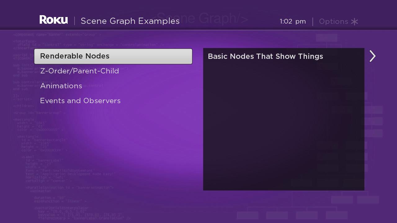
Table of Contents
Roku SceneGraph pioneers the use of sliding panels in a TV user interface, providing instant familiarity for smart phone users who "swipe" screens of information billions of times a day.
The sliding panels node classes consist of three panel node classes, a panel set node class that includes panel nodes as child nodes, an "overhang" node class, and a special Scene node class that integrates the overhang node and panel set node classes:
- Panel
- ListPanel
- GridPanel
- PanelSet
- Overhang
- OverhangPanelSetScene
The implementation of sliding panels is designed to work automatically as the user focuses or selects items in the current panel. These user actions in the current panel create a new panel that slides in from the right, containing the content targeted to the panel from the item focused or selected by the user in the current panel. The markup required to cause these panel slides is based on the same event observers, key event handling, and server content access we've seen before in this tutorial. But a lot of the panel sliding functionality is built into the sliding panels node classes, and you'll have to learn how to create and add panels in a PanelSet node.
Panel Markup
Example Application: PanelExample.zip
Node Class References: Panel, PanelSet
The simplest sliding panel node class is the Panel node. PanelExample.zip contains a component file, panel.xml, that configures a Panel node using simple markup. But the first thing you'll notice is that there is another component file, panelsetscene.xml, in the application. That's because the panel node classes are designed to only work as children of a PanelSet node. So we create, configure, and append a PanelSet node to our example Scene node:
<component name = "PanelSetExample" extends = "Scene" >

  <script type = "text/brightscript" >

    <![CDATA[

    sub init()
      m.top.backgroundURI = "pkg:/images/rsgde_bg_hd.jpg"

      m.panelset = createObject("roSGNode", "PanelSet")

      m.panel = m.panelset.createChild("PanelExample")

      m.top.appendChild(m.panelset)

      m.panel.setFocus(true)
    end sub

    ]]>

  </script>

</component>
Configuring the PanelSet node in this example consists only of creating a child PanelExample Panel node as configured in panel.xml:
<component name = "PanelExample" extends = "Panel" >
<script type = "text/brightscript" >
<![CDATA[
sub init()
m.top.panelSize = "medium"
m.top.focusable = true
m.top.hasNextPanel = false
end sub
]]>
</script>
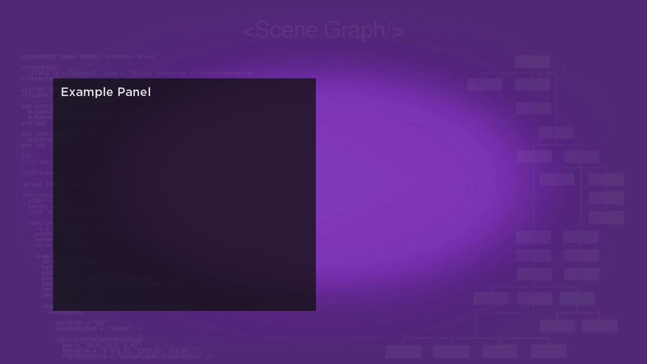
<children>
<Rectangle
id = "infoRectangle"
translation = "[ 0, 40 ]"
width = "520"
height = "460"
color = "0x101010C0" >
<Label
id = "infoLabel"
translation = "[ 15, 15 ]"
text = "Example Panel"
width = "430"
height = "490"
wrap = "true"
font = "font:MediumBoldSystemFont" />
</Rectangle>
</children>
</component>
The XML markup in the <children> element just creates a black Rectangle node with a child Label node, as we've done several times before in this tutorial. But in this case we want the Label node to fit into the medium-sized panel node configured in the <script> element init() function:
sub init() m.top.panelSize = "medium" m.top.focusable = true m.top.hasNextPanel = falseend sub
For this example, the focusable and hasNextPanel fields are not important, since we are only adding the one panel to the panel set. But you should almost always set the panelSize field to one of the default sizes listed in PanelSet when configuring any of the panel node classes. This will ensure that the panels in your panel set slide correctly, based on the size of each panel as it is added to the panel set.
When this single medium panel is added to the panel set, it shows up in the default left position of the panel set:

Later you'll see how to add several panels to a panel set, with each new panel causing a panel slide, and the content meta-data in a focused or selected item in the current panel sent to the new panel.
ListPanel Markup
Example Application: ListPanelExample.zip
Node Class References: ListPanel, PanelSet
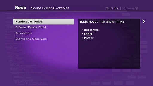
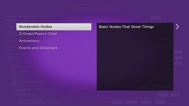
A ListPanel node adds support for a LabelList node (or other list node class) to be added and configured within a Panel node. It also adds important support for creating new panels automatically based on the user focus or selection of a list item.
We add a child ListPanel node to a PanelSet node exactly the same way as in Panel Markup, so there is no particular reason to look at panelsetscene.xml in ListPanelExample.zip. And listpanel.xml is quite similar to the panel.xml in Panel Markup:
<component name = "ListPanelExample" extends = "ListPanel" >
<script type = "text/brightscript" >
<![CDATA[
sub init()
m.top.panelSize = "medium"
m.top.focusable = true
m.top.hasNextPanel = false
m.top.leftOnly = true
m.top.list = m.top.findNode("exampleLabelList")
end sub
]]>
</script>
<children>
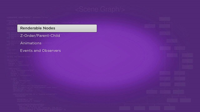
<LabelList id = "exampleLabelList" >
<ContentNode role = "content" >
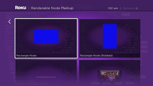
<ContentNode title = "Renderable Nodes" />
<ContentNode title = "Z-Order/Parent-Child" />
<ContentNode title = "Animations" />
<ContentNode title = "Events and Observers" />
</ContentNode>
</LabelList>
</children>
</component>
Again we set the size of the list panel node to medium, but now some of the other panel node fields are more important. We'll want to set the focusable field to true, so the user will be able to use the list. Since we only add the one child ListPanel node to the PanelSet node, we still set the hasNextPanel field to false...but for a PanelSet node that includes a dynamic and varying number of child panel nodes, this is one of several fields that becomes very important, like the leftOnly field (which has no function in this example).
But the biggest difference is adding a LabelList node to the ListPanel node. In the example, a simple LabelList node is configured in the <children> element. Then we add the LabelList node in the <script> element by setting the ListPanel node m.top.list field to the LabelList node object:
m.top.list = m.top.findNode("exampleLabelList")
And the result is like Panel Markup, except with the list integrated into the panel node in the default PanelSet node left position:
Note that the LabelList node is automatically sized and placed into the ListPanel node, one of several automatic operations that are part of the ListPanel node.
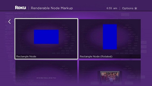
GridPanel Markup
Example Application: GridPanelExample.zip
Node Class Reference: GridPanel, PanelSet
The GridPanel node class is very similar to the ListPanel node class seen in ListPanel Markup, but automatically integrates a grid node class into a GridPanel node. Again, the panelsetscene.xml is almost identical to the same file in Panel Markup.
But the gridpanel.xml component file shows some important differences for this example:
<component name = "GridPanelExample" extends = "GridPanel" initialFocus = "examplePosterGrid" >

  <script type = "text/brightscript" >

    <![CDATA[

    sub init()
      m.top.panelSize = "full"
      m.top.isFullScreen = true
      m.top.leftPosition = 130
      m.top.focusable = true
      m.top.hasNextPanel = false
      m.top.createNextPanelOnItemFocus = false

      m.top.grid = m.top.findNode("examplePosterGrid")

      m.readPosterGridTask = createObject("roSGNode", "ContentReader")
      m.readPosterGridTask.contenturi = "http://www.sdktestinglab.com/Tutorial/content/rendergridps.xml"
      m.readPosterGridTask.observeField("content", "showpostergrid")
      m.readPosterGridTask.control = "RUN"
    end sub

    sub showpostergrid()
      m.top.grid.content = m.readPosterGridTask.content
    end sub

    ]]>

  </script>

  <children >

    <PosterGrid
      id = "examplePosterGrid"
      basePosterSize = "[ 512, 288 ]"
      caption1NumLines = "1"
      numColumns = "2"
      numRows = "2"
      itemSpacing = "[ 20, 20 ]" />

  </children>

</component>
First, for this panel node that will contain several posters in the PosterGrid node, we set the panelSize field to full, and also set the isFullScreen field to true. This configures the PanelSet node to only display this one large panel, sliding the previous panels off the screen to the left. This becomes more important if we create a dynamic panel set with many different panels of varying sizes.
Next we set a field that controls where this full-size panel will be located on the screen, and set the focus on the grid so it can be used. We also set some fields to false that we would set to true for a more dynamic panel set that automatically created new panels in response to user focus and selection actions:
m.top.leftPosition = 130m.top.focusable = truem.top.hasNextPanel = falsem.top.createNextPanelOnItemFocus = false
Then we set the m.top.grid field to the PosterGrid node created in XML markup in the <children> element, just like setting the m.top.list field to the LabelList node in ListPanel Markup. But in this example, we read the Content Meta-Data for the PosterGrid node from a server XML file. We use the same contentreader.xml Task node component file to do this as we've done before for poster grids. As always, when the Task node content reader completes the ContentNode node for the PosterGrid node, a showpostergrid() callback function is triggered by the event, and the GridPanel node shows the completed poster grid:

As you might guess, the poster grid shown can be controlled by the selection of an item in a previous panel node, by including the URI of the server XML file with the PosterGrid node Content Meta-Data as part of the Content Meta-Data for the items in the previous panel. Which leads right to the next example...
PanelSet Markup
Example Application: PanelSetExample.zip
Node Class References: PanelSet, Panel, ListPanel, GridPanel
The basic idea for developing a dynamic sliding panel user interface is to control the adding of panels to a PanelSet node. PanelSetExample.zip shows how to dynamically manage the three panel node classes with different sizes, creating or targeting each new panel node with Content Meta-Data from the current panel.
The way to accomplish this is by controlling the addition of child panel nodes to the PanelSet node. For this example, we will use the same three basic panel nodes we used in Panel Markup, ListPanel Markup, and GridPanel Markup: a medium-sized Panel node, a medium-sized ListPanel node, and a full-sized GridPanel node. We'll modify them slightly, but first, let's look at the panelsetscene.xml component file to see how to dynamically add new panels to a PanelSet node:
<component name = "PanelSetExample" extends = "Scene" >

  <script type = "text/brightscript" >

    <![CDATA[

    sub init()
      m.top.backgroundURI = "pkg:/images/rsgde_bg_hd.jpg"

      m.panelset = createObject("roSGNode", "PanelSet")
      m.top.appendChild(m.panelset)

      m.readContentTask = createObject("roSGNode", "ContentReader")
      m.readContentTask.observeField("content", "setpanels")
      m.readContentTask.contenturi = "http://www.sdktestinglab.com/Tutorial/content/panelsetcontent.xml"
      m.readContentTask.control = "RUN"
    end sub

    sub setpanels()
      m.listpanel = m.panelset.createChild("ListPanelExample")
      m.listpanel.list.content = m.readContentTask.content


      m.panel = m.panelset.createChild("PanelExample")


      m.listpanel.list.observeField("itemFocused", "showpanelinfo")
      m.panel.observeField("focusedChild", "slidepanels")


      m.listpanel.setFocus(true)
    end sub

    sub showpanelinfo()
      panelcontent = m.listpanel.list.content.getChild(m.listpanel.list.itemFocused)

      m.panel.description = panelcontent.description

      m.gridpanel = createObject("roSGNode", "GridPanelExample")

      m.gridpanel.gridcontenturi = panelcontent.url
    end sub

    sub slidepanels()
      if not m.panelSet.isGoingBack
        m.panelset.appendChild(m.gridpanel)
        m.gridpanel.setFocus(true)
      else
        m.listpanel.setFocus(true)
      end if
    end sub

    ]]>

  </script>

</component>
As in all the previous panel node examples, we create a PanelSet node object. But in this example, we use a content reader Task node to get the content meta-data we need to add two child panel nodes, the medium-sized ListPanel node and the medium-sized Panel node. When the ContentNode node for this content meta-data is ready, the change in the Task node content field triggers the setpanels() callback function that populates the first two panels:
sub setpanels() m.listpanel = m.panelset.createChild("ListPanelExample") m.listpanel.list.content = m.readContentTask.content m.panel = m.panelset.createChild("PanelExample") m.listpanel.list.observeField("itemFocused", "showpanelinfo") m.panel.observeField("focusedChild", "slidepanels") m.listpanel.setFocus(true)end sub
At this point, since we have only added two medium-sized panel nodes, both are visible in the panel set, with the first child panel node added in the default left position, and the second child panel node to the right:

The ListPanel node is used for user selection of an item in the list, and the Panel node is used to supply additional information to the user about the currently-focused item. The full-sized GridPanel node has yet to be created, so we'll handle that with a callback function triggered by an itemFocused field change in the ListPanel node list:
sub setpanels()
  ...
  m.listpanel.list.observeField("itemFocused", "showpanelinfo")
  ...
end subsub showpanelinfo() panelcontent = m.listpanel.list.content.getChild(m.listpanel.list.itemFocused) m.panel.description = panelcontent.description m.gridpanel = createObject("roSGNode", "GridPanelExample") m.gridpanel.gridcontenturi = listpanelcontent.urlend sub
The showpanelinfo() callback function does a few things. First, it gets the item Content Meta-Data for the focused item in the list, using the getChild() method on the ListPanel node list content field, with the itemFocused field value as an index into the ContentNode child node. Then the description field of the Panel node is set to the value of the description attribute field of the item Content Meta-Data (if you guessed that we added an <interface> element with a description field to the Panel node, you're right). And then the GridPanel node object is created, and the gridcontenturi field is set to the url attribute field of the item Content Meta-Data.
At this point, the full-sized GridPanel node object exists, and is set with the necessary Content Meta-Data to be fully configured. But since it has not been added to the PanelSet node, it is not visible, and doesn't cause the other panels to slide offscreen to the left. We handle that, and sliding the panels back to the original position, with another callback function triggered by focus being moved to the Panel node by a user remote key press action:
sub setpanels()
  ...
  m.panel.observeField("focusedChild", "slidepanels")
  ...
end sub
...
sub slidepanels()
  if not m.panelSet.isGoingBack
    m.panelset.appendChild(m.gridpanel)
    m.gridpanel.setFocus(true)
  else
    m.listpanel.setFocus(true)
  end if
end sub
The PanelSet node responds automatically to certain remote key presses. If the user presses the OK or Right key in a focused panel list or grid, focus is automatically sent to the next panel node to the right. If the user presses the Back or Left key, focus is automatically sent to the previous panel node to the left. We rely on this action in the slidepanels() callback function, by observing the focusedChild field of the Panel node. The Panel node is only used to supply additional information about the item focused in the ListPanel node list, so we actually don't want to focus on the Panel node at all. Instead, we use the focused state of the panel to determine whether to add the full-sized GridPanel node object, causing the panels to slide to the left, or set focus back on the ListPanel node, causing the panels to slide back to the right. We do this by checking the Boolean value of the PanelSet node isGoingBack field, which is set by the user remote key press. A OK or Right remote key press sets the field to false, a Back or Left remote key press sets the field to true. So if the field is not set to true, we append the full-sized GridPanel node object to the PanelSet node, causing the panels to slide to the left showing the grid panel. If the field is true, we set focus back on the ListPanel node, and the panels slide back to their original position.
We did have to make a few changes to the panel nodes compared to Panel Markup, ListPanel Markup, and GridPanel Markup. If you look at the listpanel.xml component file, you'll see that there aren't any significant changes. Actually, the biggest change is the addition of more Content Meta-Data for each item in the list, as seen in the server content meta-data file for this example:
http://www.sdktestinglab.com/Tutorial/content/panelsetcontent.xml
We've added description and url attribute fields to each item, in addition to the title attribute field in ListPanel Markup. That's because we'll be sending the values of these fields to the other panel nodes for automatic configuration of the panel nodes.
We do this by adding an <interface> element to the other panel nodes. This allows the Scene node to set fields in the panel node <interface> element, which causes an automatic trigger of a callback function in the node using the onChange attribute of the field.
For example, look at the <interface> element in the panel.xml component file:
<interface > <field id = "description" type = "string" onChange = "showdescription" /></interface>
When the Scene node sets the description field of the panel node with the equivalent Content Meta-Data attribute field in the ListPanel node focused list item:
panelcontent = m.listpanel.list.content.getChild(m.listpanel.list.itemFocused)m.panel.description = panelcontent.description
The change in the Panel node description field triggers the showdescription() callback function:
sub showdescription() m.infolabel.text = m.top.descriptionend sub
And the value of the description Content Meta-Data attribute field is automatically displayed as the Label node text field in the panel node. As the user moves the focus up or down the ListPanel node list, the corresponding description Content Meta-Data attribute field is automatically displayed in the panel node for each list item.
The same is true for the GridPanel node. There an <interface> element field is used to set the URI of the XML file that will configure the GridPanel node grid:
<interface > <field id = "gridcontenturi" type = "uri" onChange = "readpostergrid" /></interface>
So when the Scene node sets the gridcontenturi field, the field change triggers the readpostergrid() callback function:
sub readpostergrid() m.readPosterGridTask = createObject("roSGNode", "ContentReader") m.readPosterGridTask.contenturi = m.top.gridcontenturi m.readPosterGridTask.observeField("content", "showpostergrid") m.readPosterGridTask.control = "RUN"end sub
This reads the server XML file with the grid configuration Content Meta-Data. We've seen how this poster grid content reader works before, and as usual we set an observer on the Task node to trigger a callback function when the ContentNode node is complete. So the poster grid in the GridPanel node is configured and ready to be displayed as soon as the user selects the list item in the ListPanel node.
Overhang Markup
Example Application: OverhangExample.zip
Node Class Reference: Overhang
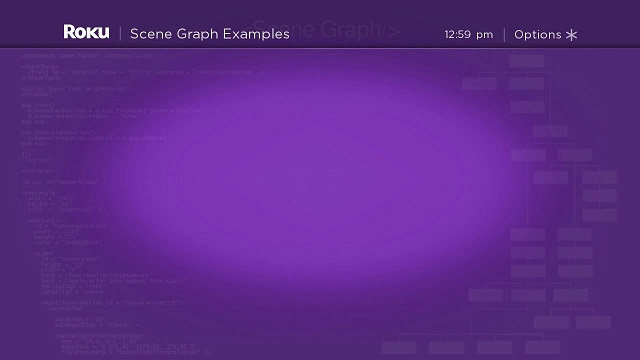
The Overhang node class is designed to be integrated into an application as part of panel set, but can be used as a stand-alone node if you want the functionality it provides, such as displaying your company logo and the time at the top of the display screen. Let's take a quick look at an example that adds an Overhang node to a scene.
In the overhangscene.xml component file, we configure an Overhang node as a child node of a Scene node in the <children> element:
<children > <Overhang title = "SceneGraph Examples" showOptions = "true" optionsAvailable = "true" /></children>
We've mostly used the default Overhang node field values for this example. We did set the showOptions and optionsAvailable fields to true to display the Options message in the Overhang node. These fields are set to false by default, to allow you to selectively set the fields at times in your application, to indicate to the user that pressing the Options remote key will display a list of selectable options.
Note that by not setting the logoUri field, the default Roku logo is displayed. You'll want to set the logoUri field to the URI of your company logo image, with dimensions similar to the default Roku logo, in your application.

OverhangPanelSetScene Markup
Example Application: OverhangPanelSetSceneExample.zip
Node Class References: OverhangPanelSetScene, Panel, ListPanel, GridPanel
We can conclude this section of the tutorial by showing a sliding panel example using the OverhangPanelSetScene node class, a special Scene node that integrates an Overhang node and a PanelSet node. The advantage of the OverhangPanelSetScene node class is the ability to configure the panels in your panel set to target sections of the Overhang node with custom appearance for each panel.
OverhangPanelSetSceneExample.zip is almost identical to PanelSetExample.zip in PanelSet Markup. The three panel nodes in the PanelSet node are the same, except for some special fields that specifically target the integrated Overhang node.
The first difference you'll see in overhangpanelsetscene.xml is that there is no need to create a PanelSet node object, because the PanelSet node is integrated into the OverhangPanelSetScene node. So when you add panel nodes to the panel set, you just refer to the integrated PanelSet node using the panelSet field:
m.listpanel = m.top.panelSet.createChild("ListPanelExample")...m.panel = m.top.panelSet.createChild("PanelExample")
This is how you add or perform all other operations on the panel nodes in the integrated PanelSet node. This is also true of the integrated Overhang node; you refer to the Overhang node fields using the Overhang field:
m.top.Overhang.showOptions = true
This causes the Options message in the Overhang node to be displayed. Likewise, we can change the title of the Overhang node, and the appearance of the Options message, as each panel slides into view, by setting special fields in the panel nodes.
In this example, we wanted the Options message to be dimmed, to indicate that pressing the Options remote key would not provide a list of options to the user at this time. We also wanted to show a specific title, SceneGraph Examples:

To do this, we set two special fields in the listpanel.xml component file init() function:
m.top.optionsAvailable = falsem.top.overhangTitle = "SceneGraph Examples"
These optionsAvailable and overhangTitle fields target the Overhang node optionsAvailable and title fields when the ListPanel node is visible on the screen. Likewise, we change the appearance of the Overhang node when the GridPanel node is visible, by setting the same fields to different values in the gridpanel.xml component file:
m.top.optionsAvailable = false...m.top.overhangTitle = m.top.overhangtext
The overhangtext field is set in the GridPanel node <interface> element, along with the gridcontenturi field:
<interface > <field id = "overhangtext" type = "string" /> <field id = "gridcontenturi" type = "uri" onChange = "readpostergrid" /></interface>
As the OverhangPanelSetScene node sets these fields for each focused item in the ListPanel node list, the GridPanel node and the Overhang node are configured as soon as the user selects the list item and the new panel slides into view:

Note that the Overhang node title has changed to Renderable Node Markup, if a user selects the Renderable Nodes item from the ListPanel node list.
Attachments:
 OverhangExample.zip (application/zip)
overhangdoc.jpg (image/jpeg)
OverhangExample.zip (application/zip)
overhangdoc.jpg (image/jpeg)
 PanelSetExample.zip (application/zip)
panelsetdoc.jpg (image/jpeg)
PanelSetExample.zip (application/zip)
panelsetdoc.jpg (image/jpeg)
 gridpaneldoc.jpg (image/jpeg)
 PanelExample.zip (application/zip)
paneldoc.jpg (image/jpeg)
PanelExample.zip (application/zip)
PanelExample.zip (application/zip)
paneldoc.jpg (image/jpeg)
 ListPanelExample.zip (application/zip)
ListPanelExample.zip (application/zip)
listpaneldoc.jpg (image/jpeg)
ListPanelExample.zip (application/zip)
ListPanelExample.zip (application/zip)
ListPanelExample.zip (application/zip)
listpaneldoc.jpg (image/jpeg)
 GridPanelExample.zip (application/zip)
gridpaneldoc.jpg (image/jpeg)
GridPanelExample.zip (application/zip)
gridpaneldoc.jpg (image/jpeg)
 panelsetdoc.jpg (image/jpeg)
 PanelSetExample.zip (application/zip)
panelsetgriddoc.jpg (image/jpeg)
PanelSetExample.zip (application/zip)
panelsetgriddoc.jpg (image/jpeg)
 OverhangPanelSetSceneExample.zip (application/zip)
OverhangPanelSetSceneExample.zip (application/zip)
overhangpanelsetscenedoc.jpg (image/jpeg)
OverhangPanelSetSceneExample.zip (application/zip)
OverhangPanelSetSceneExample.zip (application/zip)
OverhangPanelSetSceneExample.zip (application/zip)
overhangpanelsetscenedoc.jpg (image/jpeg)
 overhanggridpaneldoc.jpg (image/jpeg)
 overhangpanelsetscenedoc.jpg (image/jpeg)
 overhanggridpaneldoc.jpg (image/jpeg)
 PanelExample.zip (application/zip)
ListPanelExample.zip (application/zip)
ListPanelExample.zip (application/zip)
GridPanelExample.zip (application/zip)
PanelSetExample.zip (application/zip)
OverhangExample.zip (application/zip)
OverhangPanelSetSceneExample.zip (application/zip)
panel.jpg (image/jpeg)
PanelExample.zip (application/zip)
ListPanelExample.zip (application/zip)
ListPanelExample.zip (application/zip)
GridPanelExample.zip (application/zip)
PanelSetExample.zip (application/zip)
OverhangExample.zip (application/zip)
OverhangPanelSetSceneExample.zip (application/zip)
panel.jpg (image/jpeg)
 paneldoc.jpg (image/jpeg)
 listpaneldoc.jpg (image/jpeg)
 gridpaneldoc.jpg (image/jpeg)
 panelsetdoc.jpg (image/jpeg)
 gridpaneldoc.jpg (image/jpeg)
 overhangdoc.jpg (image/jpeg)
 overhangpanelset.jpg (image/jpeg)
 overhangpanelsetdoc.jpg (image/jpeg)
 gridpanelopsdoc.jpg (image/jpeg)
 paneldoc.jpg (image/jpeg)
listpaneldoc.jpg (image/jpeg)
gridpaneldoc.jpg (image/jpeg)
paneldoc.jpg (image/jpeg)
listpaneldoc.jpg (image/jpeg)
gridpaneldoc.jpg (image/jpeg)
 panelsetdoc.jpg (image/jpeg)
gridpaneldoc.jpg (image/jpeg)
overhangdoc.jpg (image/jpeg)
overhangpanelsetdoc.jpg (image/jpeg)
gridpanelopsdoc.jpg (image/jpeg)
panelsetdoc.jpg (image/jpeg)
gridpaneldoc.jpg (image/jpeg)
overhangdoc.jpg (image/jpeg)
overhangpanelsetdoc.jpg (image/jpeg)
gridpanelopsdoc.jpg (image/jpeg)