Table of Contents
There are a few Roku SceneGraph node classes that group screen sub-elements together to allow them to be used as a group:
- ButtonGroup
- LayoutGroup
ButtonGroup Markup
Example Application: ButtonGroupExample.zip
Node Class Reference: ButtonGroup
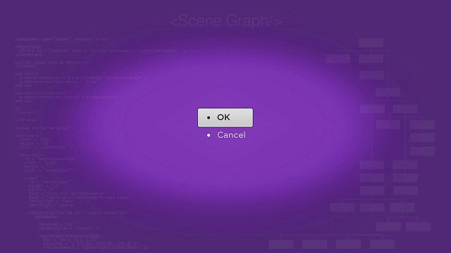
The ButtonGroup node class allows to quickly create and configure a group of several buttons that appear and operate in the same way as Button node buttons.
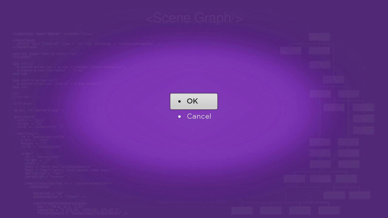
The buttongroupscene.xml component file creates two buttons by simply setting the buttons field of a ButtonGroup node object created in the <children> element with the strings that appear on the buttons:
buttongroup.buttons = [ "OK", "Cancel" ]
The required focus on the ButtonGroup node is set using the initialFocus attribute of the <component> element. With the focus set on the ButtonGroup node, the buttons appear as follows:

Note that the focus on each button is controlled by Up and Down remote keys as in a list node. And the index numbers of the buttons focused and selected also work like list nodes, with the top-most button being index 0 in the ButtonGroup node, the next button down is 1, and so forth (see Creating Lists and Grids and Lists and Grids Markup). So you can set observers on the buttonFocused and buttonSelected ButtonGroup node fields, and handle those events in callback functions in much the same way you would with a list node.
LayoutGroup Markup
Example Application: LayoutGroupColorsExample.zip
Node Class Reference: LayoutGroup
The LayoutGroup node class allows you to create evenly-spaced arrangements of multiple screen sub-elements. You can use this to create "tables" of the sub-elements if required for your application.
In layoutgroupcolorsscene.xml we create several groups of Label and Rectangle node paired sub-elements. The first group at the top show the hexadecimal definitions of the fully-saturated primary and secondary colors of the Rectangle node. The next two groups show less-saturated colors, and the third group shows different alpha channel effects for the fully-saturated and less-saturated colors. Finally the last group at the bottom shows the two default text colors used for focused and unfocused buttons and lists, set against the corresponding opposite default color:
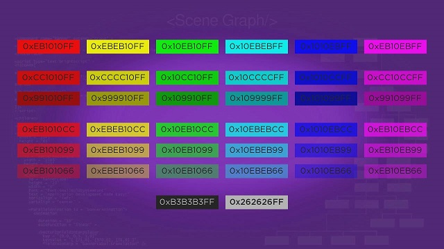
Each group consists of a LayoutGroup node with Label and Rectangle node sub-elements as children of a LayoutGroup node. The important LayoutGroup fields are the itemSpacings and layoutDirection fields. These are set to 20 and horiz respectively for all the groups to evenly space the sub-elements in the group by 20 pixels, arranged horizontally.
<LayoutGroup id = "fullysaturatedcolors" translation = "[ 0, 0 ]" itemSpacings = "[20]" layoutDirection = "horiz" > <Rectangle color = "0xEB1010FF" height = "40" width = "180" > <Label color = "0x262626FF" height = "40" width = "180" horizAlign = "center" vertAlign = "center" text = "0xEB1010FF"/> ...
...
Of course, large groups like this could be generated in a loop that automatically creates and/or adds child sub-elements for each LayoutGroup node...
Attachments:
 ButtonGroupExample.zip (application/zip)
buttongroupdoc.jpg (image/jpeg)
ButtonGroupExample.zip (application/zip)
buttongroupdoc.jpg (image/jpeg)
 LayoutGroupExample.zip (application/zip)
layoutgroupdoc.jpg (image/jpeg)
LayoutGroupExample.zip (application/zip)
layoutgroupdoc.jpg (image/jpeg)
 ButtonGroupExample.zip (application/zip)
LayoutGroupColorsExample.zip (application/zip)
buttongroupdoc.jpg (image/jpeg)
ButtonGroupExample.zip (application/zip)
LayoutGroupColorsExample.zip (application/zip)
buttongroupdoc.jpg (image/jpeg)
 layoutgroupcolorsdoc.jpg (image/jpeg)
 buttongroup.jpg (image/jpeg)
 buttongroupdoc.jpg (image/jpeg)
layoutgroupcolorsdoc.jpg (image/jpeg)
buttongroupdoc.jpg (image/jpeg)
layoutgroupcolorsdoc.jpg (image/jpeg)