Table of Contents
Lists and grids are important screen elements for the application user interface. Lists and grids allow the user to choose from a selection of items that, for example, can include the title of movie to rent or purchase, and a graphic image of the theater poster for the movie. The SceneGraph API allows you to include several data items for each item in the list or grid, such as the price to rent or buy the movie, and to display this information to the user when the user selects the item.
List and Grid Nodes
The following are the list and grid node classes supplied by Roku as part of the SceneGraph API:
These list and grid node classes are derived from the abstract base class ArrayGrid. Most of the fields described in the reference information for each list or grid node class are described in the ArrayGrid reference information, though sometimes with slightly different field names.
Lists and Grids
Lists are a single column of items arranged vertically. Grids are multiple columns of items arranged both vertically (for the items in the column), and horizontally (for the rows of items across the columns).
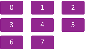
Items are indexed by list and grid nodes based on their position in the ContentNode node that defines each item in the list or grid (see Specifying List and Grid Content). The first item defined in the ContentNode node is assigned index 0, the second item is assigned index 1, and so forth. The ContentNode node index determines the position of the item in the list or grid, depending on how you define the list or grid.
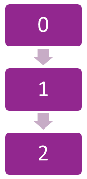
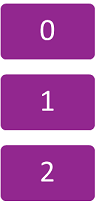
For lists, the index starts at 0 for the item at the top of the list, and increments for each item lower in the list:

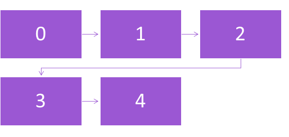
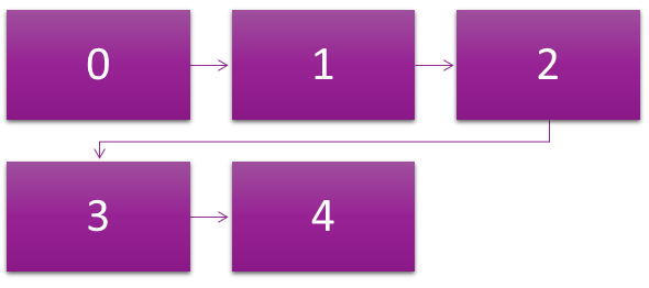
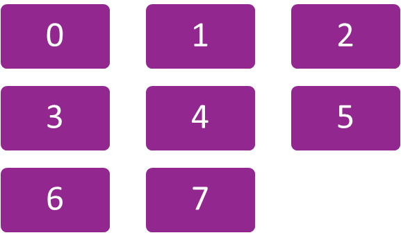
For grids, the index starts at 0 for the item at the top left corner of the grid, and increments for each item to the right in the grid row, and when the end of a row is reached, increments for the left-most item in the next lower row, and continues incrementing from left to right and top to bottom for each row in the grid. For example, if you specified a 3-column grid (by setting the numColumns field to 3 as described in List and Grid Layout Options), the index would increment as follows:
SceneGraph also provides another type of list/grid node class, RowList, that combines aspects of both lists and grids. See RowList Node Class for information about this hybrid node class.
Item Focus and Selection
Automatic remote control focus and selection of items by the user is provided by list and grid nodes. When a list or grid has remote control focus, a specific item in the list or grid has focus at any time. A list or grid node automatically responds to remote control direction pad Up and Down key presses for lists, and Up, Down, Right, and Left key presses for grids, by moving focus to the next item in that direction in the list or grid. When an item is focused, the user can select the item by pressing the OK key. Read-only fields are provided by the list or grid node class to indicate the index number of the item that is focused, unfocused after being focused, or selected at any time, allowing an application response to these user actions in the list or grid. The read-only list or grid fields that provide this information are:
| Read-Only Field | Changed Value Indication |
|---|---|
itemFocused | The list or grid item is currently focused by the user. |
itemUnfocused | The list or grid item was focused by the user, but the user moved the focus to another item. |
itemSelected | The list or grid item was selected by the user by pressing the remote control OK key. |
You can use the ObserveField() interface function for the list or grid node to trigger a callback function in response to changes in these fields. For example, the following calls a displayepisodeinfo() function that could provide additional information to the user as the focus moves to an item in a list of TV program episodes:
m.episodelist.ObserveField("itemFocused","displayepisodeinfo")
Likewise, if the user selects the item by pressing the remote control OK key, you can write a playepisode() callback function triggered by the itemSelected field event to begin playback of the selected episode:
m.episodelist.ObserveField("itemSelected","playepisode")
Since the index number for each item is the position of each child item in the ContentNode node that defines the list or grid, you can use them to retrieve data from the child ContentNode node associated with the item (or also from parallel arrays you have created for this purpose). This allows you retrieve the data needed to write the callback functions that are triggered by the list or grid item field changes. For example, the following accesses TV episode data in the ContentNode node for a list using the getChild() interface function taking the itemFocused field value as the argument, as part of a callback function to display TV episode information for the focused episode list item:
episodeinfo = m.episodelist.content.getChild(m.episodelist.itemFocused)
The list or grid node class also provides options for automatically indicating to the user that focus is on an item. The item can have a different color, or a bitmap drawn on the item, to indicate focus. The list or grid node class includes default 9-patch PNG bitmaps that surround the selected item, as well as an automatic text color change for lists of label items, but you can also customize these focus indicators for your design. The fields used to customize these options are:
| Focus Option Field | Use |
|---|---|
drawFocusFeedback | Specify whether the focus graphic image is drawn on a focused item or not |
drawFocusFeedbackOnTop | Specify whether the focus graphic image is drawn on top or underneath the focused item |
focusBitmapUri | Specify a custom graphic image to be drawn on the item to indicate focus |
focusFootprintBitmapUri | Specify a custom graphic image for a focused item when the list does not have currently have focus |
focusedColor | Sets the text color of the focused list item, for LabelList nodes only |
focusedFont | Sets the font of the focused list item, for LabelList nodes only |
If you want a custom focus indicator that cannot be defined using these fields, you should use one of the node classes described in Custom Item Definitions and Focus Indicators.
Specifying List and Grid Content
The items included, and some of their display configuration, for a list or grid node class is specified by setting a ContentNode node as the value of the content field of the list or grid node. The parameters of each item in a list or grid is specified as a child ContentNode node of the ContentNode node specified in the content field.
The easiest way to do this is by reading the content data from an XML or JSON file, either from an application package file or a file downloaded from your server. Then use the BrightScript or the BrightScript component parsing functions to parse the data in a loop that creates the ContentNode node and child ContentNode nodes, and assign the resulting ContentNode to the content field of the list or grid. For examples, see:
- ContentNode Description for the general procedure using the roSGNode interface functions
- Task Example for a specific code example of configuring a ContentNode node for a LabelList node using a Task node
- Downloading Server Content also shows the server (or application package) XML file for the same example, and how the ContentNode node is assigned to the LabelList node
- ContentNode Example also shows how to manually set up a ContentNode node for a LabelList node in BrightScript
List and Grid Layout Options
You have many options for arranging and displaying the items in a list or grid. Specific options depend on the type of list or grid you want to display.
For all lists and grids, you can specify a default size of the items in the list or grid. You can also specify the default spacing between each item in the list or grid. But you can also override the default size and spacing of items that you have set with individual sizes and spacings for each item in the list or grid. The fields to control these options are:
itemSizeorbasePosterSize(for list or grid items that are posters)rowHeightscolumnWidthsitemSpacingrowSpacingscolumnSpacings
For all lists and grids, you can specify the number of visible item rows for the list or grid by setting the numRows field, but the actual number of rows will always depend on the number of items in the list or grid, as specified by the ContentNode node set as the value of the content field for the list or grid node. For grids, you can specify the number of item columns, by setting the numColumns field.
Lists and grids can also be divided into sections, and each section can have an icon, a label, and other customizable elements to visually divide the list or grid sections. The list or grid node class includes default section divider bitmaps. To divide your list or grid into sections, you must create a child ContentNode node for each section in your ContentNode node specified in the content field, that includes the child ContentNode nodes for each list or grid item in the section.
The fields to set the appearance of section dividers are:
sectionDividerFontsectionDividerTextColorsectionDividerBitmapUrisectionDividerSpacingsectionDividerWidthsectionDividerHeightsectionDividerMinWidthsectionDividerLeftOffset
Wrapping, Fixed and Floating Focus
In addition, you have two options for how the list or grid operates as the user presses the direction pad keys. You can have a list or grid with the items or grid rows scroll into a fixed focus area as the Up and Down direction keys are pressed. When the user reaches the last or first item or grid row, the list or grid wraps back to the first or last item or grid row. Or you can have the focus move up, down, left, and right in the list or grid. The fields to set these options are:
horizFocusAnimationStylevertFocusAnimationStyle
If the list or grid is set to wrap when the first or last item is reached, the list or grid node provides a default visual divider element between the first and last items that can be customized. The fields used to customize the wrap divider element are:
wrapDividerBitmapUriwrapDividerWidthwrapDividerHeight
Custom Item Definitions and Focus Indicators
The RowList, MarkupList, and MarkupGrid node classes provide the ultimate flexibility to present lists and grids with fully-customized item appearance and focus indicators. These node classes allow you to create a custom component for list or grid items to define whatever appearance and behavior you want for your application. If you want to have several posters with multiple labels in each list or grid item, and animate them to appear and disappear as the item is focused and unfocused, you'll want to use these customizable list/grid node classes.
The key to customizing these node classes is to create custom item definitions in a component XML file. You define all the screen elements you need for your custom list/grid items in this item component file, such as posters, labels, rectangles, and so forth. Then you can create custom appearance and behavior for the items by writing callback functions triggered by onChange events in the <interface> element fields you select for the item. These customizable list/grid node classes provide a much greater selection of built-in <interface> element fields than those provided by the standard list/grid node classes. These additional fields allow you program custom appearance and behavior of the item, such as custom animations when the user focuses/selects the items.
The additional read-only <interface> element fields for item components in these customizable lists and grids are:
widthheightindexfocusPercentlistHasFocus(MarkupList node class only)gridHasFocus(MarkupGrid node class only)
When the list or grid is created, an instance of the item component is created for each item node definition included in the ContentNode node for the list or grid. Each one of these item instances can then respond according to the scripts included in the item component file as user or other program events occur, by triggering callback functions in the item component.
RowList Node Class
The RowList node class is a special list/grid node class that mixes aspects of both lists and grids. A RowList node component consists of a set of one or more rows of items, each of which, when focused, scrolls horizontally as the user presses the Right or Left keys to focus on items in the row. Items in other rows in the list do not scroll along with the focused row as they would for a grid. To focus on another row, the user presses the Up and Down keys to select the row, as they would to focus on items in a list.
The RowList node class has additional fields for the row focused/selected, the entire RowList node focused, the item focused/selected in a row, and a 2-element array field type indicating the selected item in a focused row. The additional read-only fields are:
rowIndexrowFocusPercentrowHasFocusrowListHasFocus
The additional read-only 2-element fields containing the item focused/selected are:
rowItemFocusedrowItemSelected
The first element of these field arrays contain the index of the focused/selected row; the second element contains the index of the focused/selected item in the focused row.
Custom Focus Indicators
The RowList, MarkupList, and MarkupGrid node classes provide special <interface> fields for item component definitions that enable animations to indicate focus changes to the user. The focusPercent field can be used with an onChange attribute callback function to animate focus indicators as focus moves from item to item. The focusPercent field is the fractional value, from 0.0 to 1.0, of a time delay after focus has moved from one item to the next. The fractional value increases incrementally from 0.0 to 1.0 for the newly-focused item, while simultaneously decreasing from 1.0 to 0.0 for the previously-focused item. For example, to enlarge a poster slightly when the item receives focus, while simultaneously shrinking the poster of the previously focused item, you could set up an <interface> element focusPercent field onChange callback function showfocus() in the item component XML file:
<interface> ... <field id="focusPercent" type="float" onChange="showfocus" />
...</interface>
<script> <![CDATA[
...
sub showfocus()
    scale = 1 + (m.top.focusPercent * 0.08)
    m.itemposter.scale = [scale, scale]
  end sub
...
The RowList node class also includes the rowFocusPercent field to allow animating a focus indicator when the user focuses on an item in an adjacent row, either above or below the previously-focused row.
Optimizing the Rendering Performance of Lists and Grids
There are two advanced methods to optimize the rendering speed of complex lists and grids.
Optimizing Lists and Grids with Multiple Item Sub-Elements
Lists and grid items can contain several sub-elements (such as rental/purchase prices, MPAA rating icons, and so forth) that can be drawn on top of or adjacent to the item. The default method of drawing list or grid items is to render all of the items and any sub-elements in one rendering operation. For complex lists or grids with several sub-elements drawn for each item, this default method may render the list or grid slowly. To increase the performance of rendering complex lists and grids, there is a special field in list and grid nodes, numRenderPasses, that controls the rendering of the list or grid items in conjunction with the renderPass field of the item sub-elements.
If you decide to optimize the performance of complex lists and grids, you must set up a sequence of rendering of the list or grid item sub-elements, so all the sub-elements for the items render in sequential order rather than in one rendering operation. To do this, decide which sub-elements to render in which order of a sequence of rendering operations. For example, the main poster for an grid item may have a label and a smaller poster drawn on top of it. You can specify that the main poster will render first, the label second, and the smaller poster third, by setting the renderPass field value for each of these sub-elements to 1, 2, and 3, respectively. Then you set the grid numRenderPasses field value to 3, the total number of rendering operations for the grid.
Be very careful when setting the list or grid numRenderPasses and the item sub-element renderPass field values. If you set the numRenderPasses field to a value greater than 1, any list or grid item sub-element renderPass field value that is set to 0 (the default), or to a value greater than the numRenderPasses field value, will not render.
Optimizing Grids with Different Sized or Large Poster Items
You can optimize the rendering speed of grids that have poster items of several different sizes, or are very large, by setting the grid useAtlas field value to false. The field value toggles the use of a texture atlas that stores the posters in the grid. The default is true, since in many cases, most of the posters in the grid have the same size as determined by the grid basePosterSize field value. In this case, using the texture atlas can provide a rendering performance benefit. For grids that have more complicated layouts, that include several posters that have sizes that differ from the value of basePosterSize, or for grids where there are only a few large posters (about five to eight, or posters that are about a quarter of the screen height or width) displayed at the same time, setting this field to false may provide faster rendering speed of the grid.
Attachments:
 gridseq.png (image/png)
 listseq.png (image/png)
 gridseq2.png (image/png)
 listseq2.png (image/png)
 rnewlistseq60.png (image/png)
 rnewlistseq60.png (image/png)
rnewgridseq.png (image/png)
rnewlistseq60.png (image/png)
rnewgridseq.png (image/png)
 rnewgridseq60.png (image/png)