Example Application: CheckListExample.zip
Node Class Reference: CheckList
The CheckList node class allows a user to select one or more (or all) items in a list by pressing the OK remote key when the item is focused and not selected. When the item is selected, Boolean true is set in the checkedState field array at the position of the index number of the selected item, and a selected icon appears next to the item (by default, a checkmark icon). Selecting a currently-selected item unselects the item, sets Boolean false at the item index number position in the checkedState field array, and removes the selected icon from the item.
A CheckList node can be used for the user to set one or more options. The value of the checkedState field array can be used to set component or global application options.
The CheckList node is extended from the LabelList node, and works very much like a standard LabelList node, with the exception of the checkedState field array, and the selected icon. CheckListExample.zip shows a CheckList node with the first and third items in the list checked, by setting the checkedState field array to [true,false,true,false] :
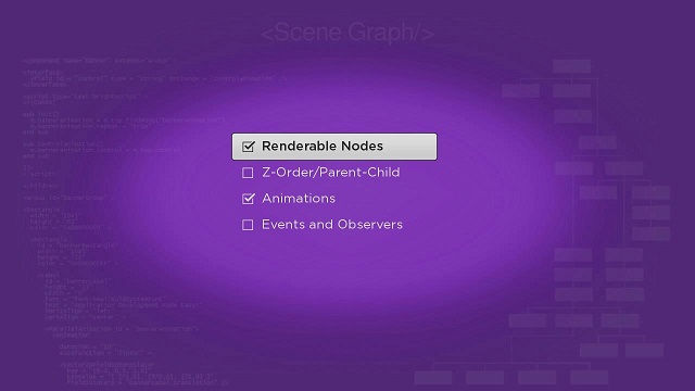
A user can deselect these items by focusing on the item, and pressing the OK remote key, and select an unselected item by focusing on the item, and pressing the OK key. Each change in the selected items changes the values in the checkedState field array. In a real application, you might want to group a CheckList node with a Button node to allow the user to inform the application that new items have been selected (or deselected), and let the application dismiss the list, and use the new option values in the application.