Table of Contents
Extends:
Also See Related Page:
List and Grids Markup - CheckList Markup
Description
The CheckList node class is a simple list class that displays a list of items, some of which include checkboxes that allow the user to select or unselect that item. Each item in the list displays a text string and an optional checkbox icon positioned to the left of the text string.
If the checkbox is displayed, it is shown as either:
- an empty box,
- or a box with a checkmark indicator inside indicating whether the item is in the checked or unchecked state.
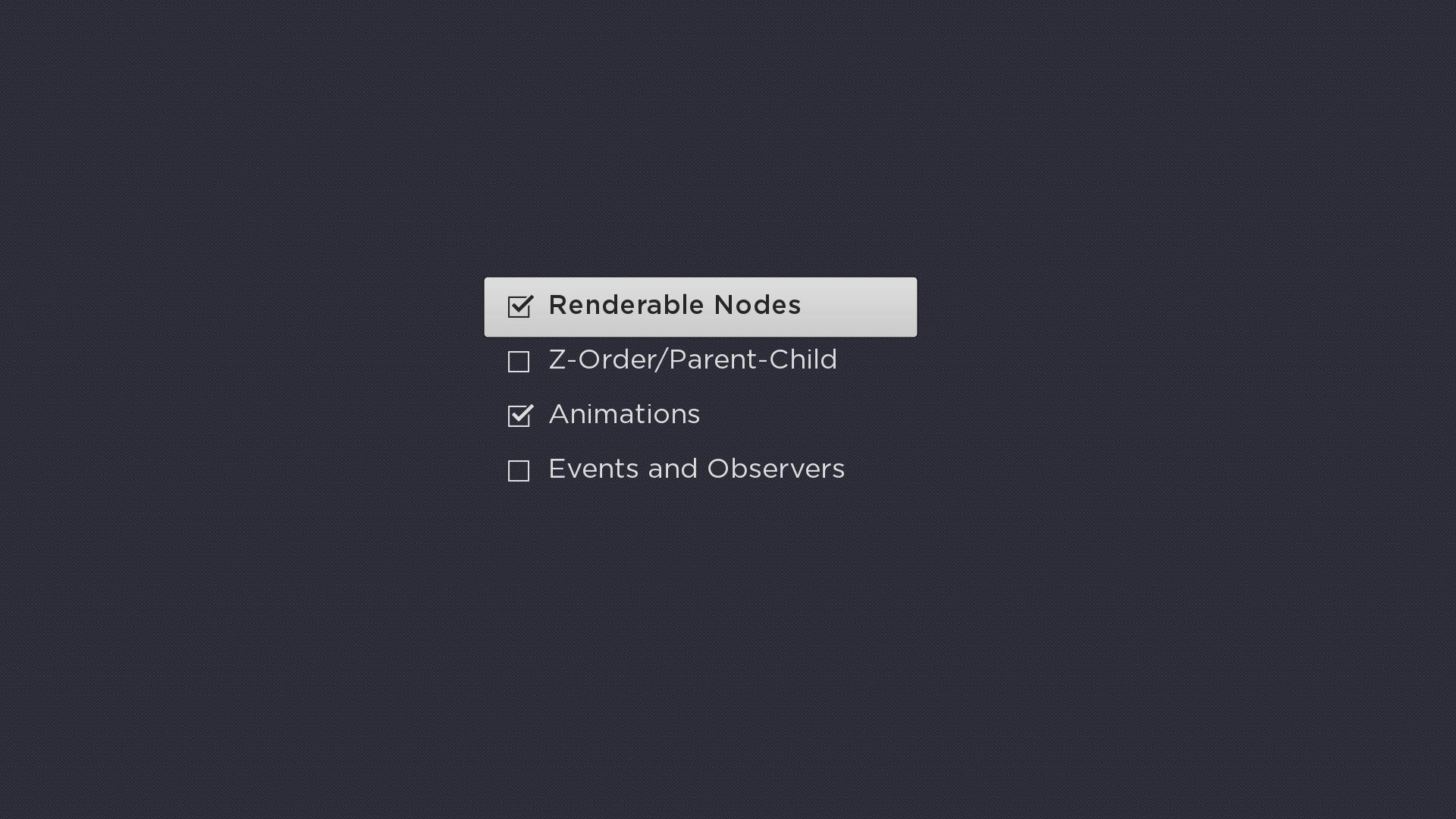
Example
The following is a sample screenshot showing the use of CheckList:
Fields
| Field | Type | Default | Use |
|---|---|---|---|
| checkedState | array of Boolean | all false | Specifies the checked state of each item in the list. A value of true indicates the item is in the checked state. A value of false indicates that the item is in the unchecked state. When reading the value of the field, note that the field array will always include one value for each item in the list. When writing the value of the field, if the specified array includes fewer values than items in the list, the list items that are unspecified will remain in their current state. For example, if there are 10 items in the list and the field value is set to |
| checkOnSelect | Boolean | true | Controls whether or not pressing the remote control OK key causes the |
| checkedIconUri | uri | "" | Specifies the checkbox icon to use for list items that are in the checked state when that list item does not the key focus. Typically, the icon will include the outline of a box with a checkmark indicator inside. Only set this field to specify a custom bitmap that differs in appearance from the default bitmap. |
| uncheckedIconUri | uri | "" | Specifies the checkbox icon to use for list items that are in the unchecked state when that list item does not have the key focus. Typically, the icon will include the outline of an empty box. Only set this field to specify a custom bitmap that differs in appearance from the default bitmap. |
| focusedCheckedIconUri | uri | "" | Specifies the checkbox icon to use for list items that are in the checked state when that list item has the key focus. Typically, the icon will include the outline of a box with a checkmark indicator inside. Only set this field to specify a custom bitmap that differs in appearance from the default bitmap. |
| focusedUncheckedIconUri | uri | "" | Specifies the checkbox icon to use for list items that are in the unchecked state when that list item has the key focus. Typically, the icon will include the outline of an empty box. Only set this field to specify a custom bitmap that differs in appearance from the default bitmap. |
Data Bindings
The data model for the CheckList node should have a single ContentNode node as the root node in its content field. The structure of the rest of the data model depends on whether or not the list items are to be grouped into sections.
List Items Not Grouped Into Sections
If the list items are not to be grouped into sections, one child ContentNode node should be added to the root node for each item in the list (these child nodes can be thought of as item nodes). Item nodes should have their ContentNode attributes set as shown in the table below.
| Attribute | Type | Description |
|---|---|---|
| TITLE | string | The label for the list item |
| HIDEICON | Boolean | When set to true, the default, the list item displays the checkbox icon, reflecting the item's current selection state. When set to false, no checkbox icon is displayed, allowing the list to contain a mix of checkbox and regular list items. |
List Items Grouped Into Sections
If the list items are to be grouped into sections, one child ContentNode node should be added to the root node for each section in the list (these child nodes can be thought of as section roots). Each section root should contain one child ContentNode node for each item in the section (that is, item nodes). Each item ContentNode node uses the same attributes as the item nodes when there are no sections, as shown in the table above.
The section root ContentNode nodes use the following attributes:
| Attribute | Type | Description |
|---|---|---|
| CONTENTTYPE | string | Must be set to SECTION |
| TITLE | string | Label for the section divider |
| HDGRIDPOSTERURL | uri | The image file for the icon to be displayed to the left of the section label when the screen resolution is set to HD. |
| SDGRIDPOSTERURL | uri | The image file for the icon to be displayed to the left of the section label when the screen resolution is set to SD. |