Example Application: RadioButtonListExample.zip
Node Class Reference: RadioButtonList
Overview
- The RadioButtonList node class provides a list where a single list item can be exclusively selected by pressing the OK remote key when the item is focused. When the item is selected, the
checkedItemfield is set with the index number of the selected item, and an icon (by default a checkmark) appears next to the item. Focusing and selecting another list item changes the index number set in thecheckedItemfield to the new selected item, and moves the selected icon to the new item. - The RadioButtonList node allows a user to set an exclusive option in your application. You can use the
checkedItemfield to set a component or global application option. - The RadioButtonList node is extended from the LabelList node but has two additional components:
- the
checkedItemfield, and - the ability to select an icon.
- the
The RadioButtonListExample.zip shows a RadioButtonList node with the third item in the list checked, by setting the checkedItem field to 2:
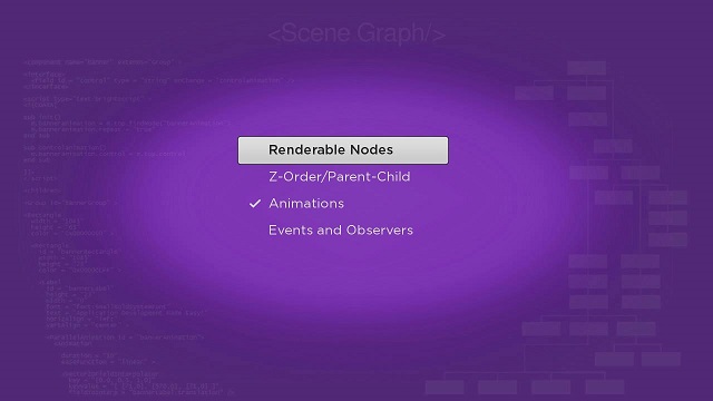
If a user selects another item in the list, the checkedItem field will be set with the index number of the new selected item.
In a real application, we suggest you group a RadioButtonList node with a Button node to:
- allow the user to inform the application that a new item has been selected, and
- let the application dismiss the list, and use the new option value in the application.