Table of Contents
Extends:
Also See Related Page:
List and Grids Markup - RadioButtonList Markup
Description
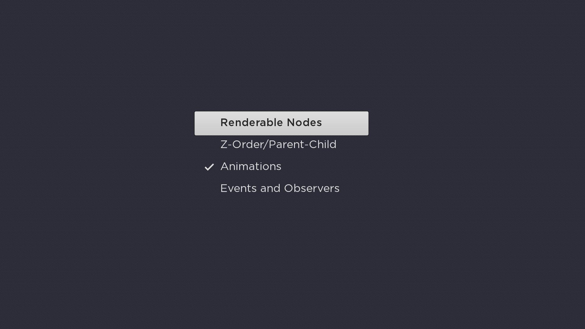
The RadioButtonList node class is a simple list class that can be used to display a list of mutually exclusive radio buttons. Each item in the list displays a text string and an optional check mark icon positioned to the left of the text string that indicates which of the radio buttons is currently selected.
Example
The following is an example screenshot showing the use of RadioButtonList:
Fields
| Field | Type | Default | Use |
|---|---|---|---|
| checkedItem | integer | -1 | Specifies the index of the currently selected item in the list. The initial default value of -1 indicates that no radio button is currently selected. Setting the field changes the currently selected radio button list item to match the specified index. |
| checkOnSelect | Boolean | true | Controls whether or not pressing the remote control OK key causes the |
| checkedIconUri | uri | "" | Specifies the check mark icon to use for the currently selected radio button list item when that list item does not have the key focus. Only set this field to specify a custom bitmap that differs in appearance from the default bitmap. |
| focusedCheckedIconUri | uri | "" | Specifies the check mark icon to use for the currently selected radio button list item when that list item has the key focus. Only set this field to specify a custom bitmap that differs in appearance from the default bitmap. |
Data Bindings
The data model for the RadioButtonList node should have a single ContentNode node as the root node, with one child ContentNode node added to the root node for each item in the list (these child nodes can be thought of as item nodes). Item nodes should have their ContentNode attributes set as shown in the table below.
| Attribute | Type | Description |
|---|---|---|
| TITLE | string | The label for the list item |
