Table of Contents
Extends:
Also See Related Page:
List and Grids Markup - RowList Markup
RowList
Overview
The RowList node class provides a vertically-scrollable list, containing rows of independent horizontally-scrollable individual items. Each item in a row can include a poster, but can also include much more complex sub-elements defined in an item component file, in the same way that items are defined in the MarkupList and MarkupGrid node classes.
Like those node classes, the RowList node class provides special interface fields to the item components to allow custom appearance and animations as the user scrolls left and right through the items in a row.
Special Feature
Guidelines
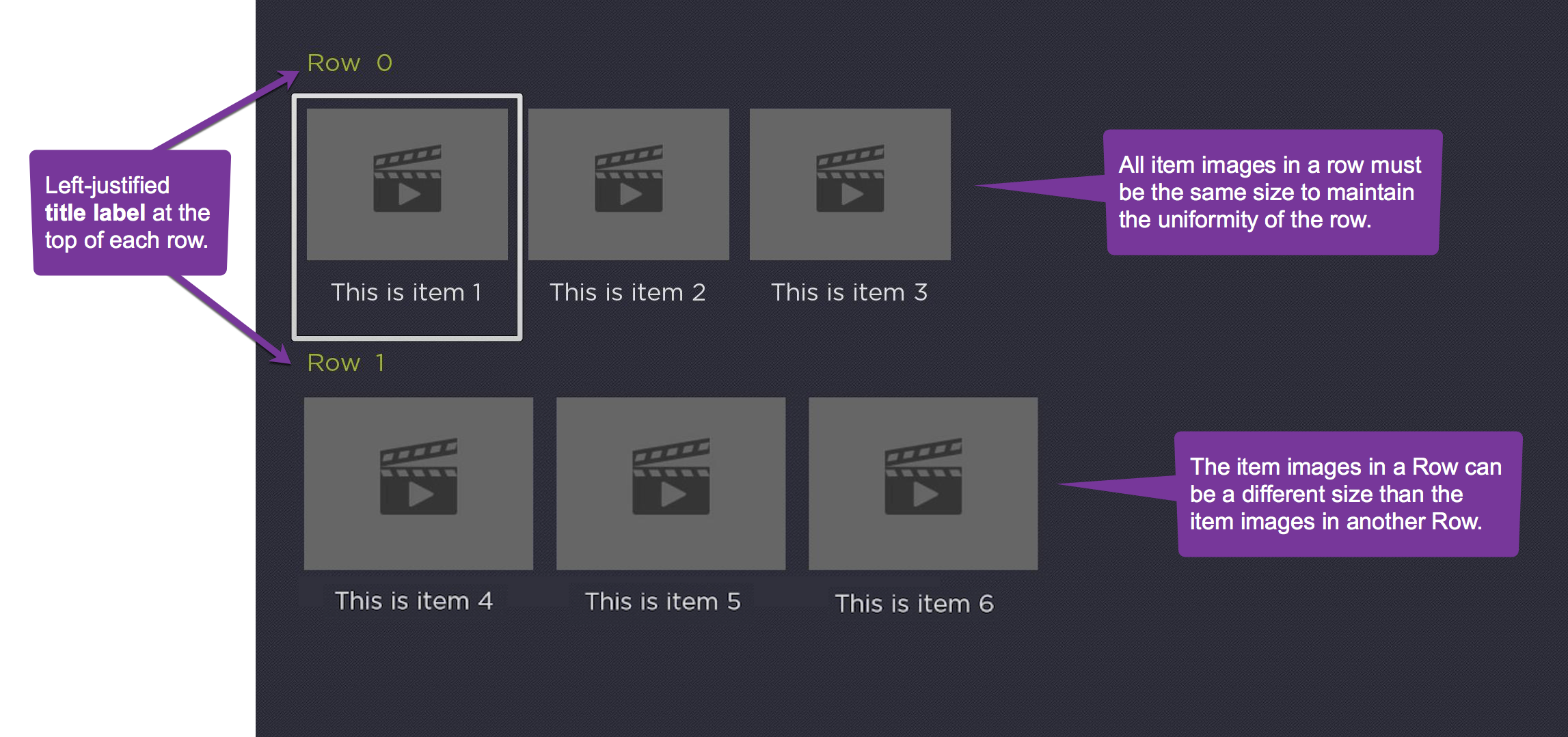
The following are guidelines for use of rows and images.
- The items in any single row must be the same size, however different rows in the list can have different item sizes (see sample image below).
- Each row may include a left-justified title label at the top of the row, and a right-justified label at the top that displays a message of the format "item_number of total_number_of_items", indicating which item in the row currently has focus.
Horizontal Row Scrolling
There are two horizontal item scrolling options for the RowList node class controlled by the rowFocusAnimationStyle field.
- Setting the
rowFocusAnimationStylefield tofloatingFocuscauses the focus indicator to float left or right until it reaches the end of the row, at which point the focus will stay fixed on the first or last item in the row, and the items will scroll left or right. - Setting the
rowFocusAnimationStylefield tofixedFocusWrapcauses each row to wrap around when navigation reaches the first or last item in the row, as long as the row contains enough items to fill the row. If the row does not contain enough items to fill the row, the focus will float left and right.
Vertical Row Scrolling
The vertical row scrolling options are controlled by the vertFocusAnimationStyle field, and behave in the same way for rows as they do for list items as described in ArrayGrid.
The RowList node class supports two types of item definitions.
- The first type provides a simple option for the common case where each item in each row is displayed as a single poster.
- The second variation allows the contents of each item in each row to be an instance of a SceneGraph component that defines a set of interface fields that provide for communication between the RowList node and the items it displays (similar to that used by the MarkupList and MarkupGrid node classes).
Example
The following is a sample screenshot of RowList based on SimpleRowlist sample code:
In the field descriptions below, the first type is referred to as simple, and the second type is referred to as component. Most of the field descriptions below apply to both simple and component types.
Behavior Changes
Whenever all the items in a RowList row are visible, the focus will step one-by-one across the items, rather than step once, then smooth scroll.
Each time the RowList focus animation completes a step, the RowList's rowItemFocused field will be set. This allows the Bob to be immediately updated. This will happen when long press scrolling after the initial step ends prior to the smooth scrolling. It will also happen when long press scrolling across a short RowList row as the focus now steps one-by-one across the items in a short row. Previously, the rowItemFocused field was only set once after a long press scrolling key release event.
Fields
| Field | Type | Default | Simple/Component | Use | ||||||||
|---|---|---|---|---|---|---|---|---|---|---|---|---|
| itemComponentName | string | "" | component | Specifies the name of an XML component for the items in each row. An instance of this component is created on demand for each visible item of each row. The XML component must define a specific interface as detailed in RowList XML Component below. | ||||||||
| rowTitleComponentName | string | "" | component | Specifies the name of an XML component to render titles in place of the row label. This component must extend from Group. If this component defines a "content" field, it will be set to the row's content. If this component defines a "rowCounterVertAlign" field (possible values are "top", "center", and "bottom"), the row counter's vertical alignment is respective of the row title component. Available since firmware version 7.5 | ||||||||
| content | ContentNode | none | both | Specifies the content for the list. The content should be a single ContentNode that has one child ContentNode for each row. These child ContentNodes for each row should themselves contains child ContentNodes for each item in the row. See Data Bindings below for more details. | ||||||||
| itemSize | vector2d | [0,0] | both | Specifies the width and height of rows in the list. Note that this the width of the entire row, not the width of the posters in the row. | ||||||||
| itemSpacing | vector2d | [0,0] | both | Specifies the spacing between rows in the list. The y-dimension of the vector specifies the vertical spacing between rows, and the x-dimension is ignored. | ||||||||
| numRows | integer | 0 | both | Specifies the number of visible rows in the list. Note that the actual number of rows may be more or less than the number of visible rows depending on the number of items in the list content. | ||||||||
| rowHeights | array of floats | [ ] | both | Specifies the heights of each row of the list. This allows the height of each row of the list to vary from row to row. The values override the height specified in the y-dimension value of the | ||||||||
| rowSpacings | array of floats | [ ] | both | Specifies the spacing after each row of the list. This allows the spacing between rows to vary from row to row. The values override the vertical spacing specified in y-dimension value of the | ||||||||
| rowItemSize | array of vector2d | [ ] | both | Specifies the width and height of the items in each row. The array of values must include at least one element. If the array contains fewer elements than the number of rows in the data model, the last value in the array is used as the size for the extra rows. | ||||||||
| rowItemSpacing | array of vector2d | [ ] | both | Specifies the spacing between items in each row. The x-dimension of each array value specifies the horizontal spacing between list items in the corresponding row. If the array contains fewer elements than the number of rows in the data model, the last value in the array is used as the spacing for the extra rows. If the array contains no values, no space will be included between list items in all rows. | ||||||||
| focusXOffset | array of floats | [ ] | both | Specifies the x-dimension offset of the first fully visible item in each row relative to the left edge of the list. In most cases, the first fully visible item in each row will be positioned at the left edge of the list, so this field does not need to be specified. If the array contains fewer elements than the number of rows in the data model, the last value in the array is used as the x-dimension offset for the extra rows. If the array contains no values, the default x-dimension offset of 0.0 is used. | ||||||||
| rowLabelOffset | array of vector2d | [0,0] | both | Specifies the offset of the row label for each row. The x-dimension specifies the horizontal offset of the label from the left edge of the row. The y-dimension component specifies the vertical spacing between the label and the list items in the row. If the array contains fewer elements than the number of rows in the data model, the last value in the array is used as the offset for the labels of the extra rows. If the array specified contains no values, a default offset value of | ||||||||
| showRowLabel | array of Boolean | [ ] | both | Specifies whether the row label on the left edge of each row is displayed. If the array contains fewer elements than the number of rows in the data model, the last value in array is used to control the display of the row label for the extra rows. If the array contains no values, no row labels are displayed. | ||||||||
| showRowCounter | array of Boolean | [ ] | both | Specifies whether the "item_number of total_number_of_items" label on the right edge of each row is displayed. Note that the "item_number of total_number_of_items" label is only displayed for the focused row even if the | ||||||||
| variableWidthItems | array of Boolean | [ ] | both | This field is only supported when By default, all items in a row of the RowList node have the same width and height. By setting
The Example: If you only specify If any item does not specify the | ||||||||
| rowFocusAnimationStyle | option string | floatingFocus | both | Specifies the how the focus indicator moves in a row of items in response to the remote direction pad Left and Right key presses. The possible values are:
| ||||||||
| vertFocusAnimationStyle | option string | "fixedFocus" | both
| Specifies the how the focus indicator moves in a list or a column of grid items in response to the remote direction pad Up and Down key presses. The possible values are:
| ||||||||
| rowLabelColor | color | 0xffffffff | both | Specifies the color of the row and "item_number of total_number_of_items" labels. | ||||||||
| rowLabelFont | font | system default | both | Specifies the font for the row and "item_number of total_number_of_items" labels. | ||||||||
| rowCounterRightOffset | float | This function is available in firmware 7.7 or later. Field provides greater control over the UX. When set, this value specifies the location of the right edge of the row counter relative to right edge of the RowList's clipping rectangle. If not set, the right edge of the row counter is positioned to equal the left offset of the row title. | ||||||||||
| showRowCounterForShortRows | Boolean | true | This function is available in firmware 7.7 or later. Field provides greater control over the UX. When set to true, the row counter is shown for all rows. When set to false, the row counter is not shown for rows where all items fit onscreen. | |||||||||
| fadeFocusFeedbackWhenAutoScrolling | Boolean | false | This function is available in firmware 7.7 or later. When set to true, the focus feedback indicator will quickly fade out when scrolling multiple items and fade back in when the scrolling ends. The focus feedback indicator will also after in and out when using the FFW/Rewind keys to scroll a page at a time. Note: This field is defined on ArrayGrid and thus is inherited by all of the following components: LabelList, MarkupList, PosterGrid, MarkupGrid, RowList, CheckList, and RadioButtonList. | |||||||||
| currFocusFeedbackOpacity | float | This function is available in firmware 7.7 or later. This field is read-only. Note: This field is defined on ArrayGrid and thus is inherited by all of the following components: LabelList, MarkupList, PosterGrid, MarkupGrid, RowList, CheckList, and RadioButtonList. | ||||||||||
| drawFocusFeedbackOnTop | Boolean | false | both | Specifies whether the focus indicator bitmap is drawn below or on top of the list items. | ||||||||
| drawFocusFeedback | Boolean | true | both | Specifies whether or not the focus indicator bitmap is displayed. | ||||||||
| imageWellBitmapUri | uri | "" | simple | Specifies the bitmap file to use to suggest where images would appear for empty lists. | ||||||||
| focusBitmapUri | uri | "" | both | Specifies the bitmap file used for the focus indicator when the list has focus. In most cases, this should be a 9-patch image that specifies both expandable regions as well as margins. Only set this field to specify a custom bitmap that differs in appearance from the default bitmap. | ||||||||
| focusFootprintBitmapUri | uri | "" | both | Specifies the bitmap file used for the focus indicator when the list does not have focus. In most cases, this should be a 9-patch image that specifies both expandable regions as well as margins. Only set this field to specify a custom bitmap that differs in appearance from the default bitmap. | ||||||||
| focusBitmapBlendColor | color | 0xFFFFFFFF | both | Blend the graphic image specified by focusBitmapUri with the specified color. If set to the default, 0xFFFFFFFF, no color blending will occur. Set this field to show a focus indicator graphic image with a different color than the image specified by focusBitmapUri. | ||||||||
| focusFootprintBlendColor | color | 0xFFFFFFFF | both | Blend the graphic image specified by focusFootprintBitmapUri with the specified color. If set to the default, 0xFFFFFFFF, no color blending will occur. Set this field to show a focus footprint indicator graphic image with a different color than the image specified by focusFootprintBitmapUri. | ||||||||
| loadingBitmapUri | uri | "" | simple | Specifies a bitmap file to display while a list item poster is loading. | ||||||||
| loadingBitmapOpacity | float | 1.0 | simple | Specifies an opacity value used to render the loading bitmap. | ||||||||
| failedBitmapUri | uri | "" | simple | Specifies a bitmap file to display when a list item poster fails to load. | ||||||||
| failedBitmapOpacity | float | 1.0 | simple | Specifies an opacity value used to render the failed bitmap. | ||||||||
| wrapDividerBitmapUri | uri | "" | both | Specifies the bitmap file to use as a visual separator between the last and first list items when the list wraps. In most case, this should be a 9-patch image that specifies both expandable regions. Only set this field to specify a custom bitmap that differs in appearance from the default bitmap. | ||||||||
| wrapDividerHeight | float | 0 | both | Specifies the height of the divider. The wrap divider bitmap will be scaled to this height. The width of the wrap divider is set to the width of the list items (that is, the x-dimension value of the | ||||||||
| rowItemSelected | array of integer | [ ] | both | Read-Only When an item is selected, set to a 2-element array, where element 0 contains the index of the row containing the selected item, and element 1 contains the index of the selected item in that row. | ||||||||
| rowItemFocused | array of integer | [ ] | both | Read-Only When an item gains the key focus, set to a 2-element array, where element 0 contains the index of the focused row, and element 1 contains the index of the focused item in that row. | ||||||||
| itemSelected | integer | 0 | both | Read-Only When an item is selected, set to the index of the selected row. | ||||||||
| itemFocused | integer | 0 | both | Read-Only When a row gains the key focus, set to the index of the focused row. | ||||||||
| itemUnfocused | integer | 0 | both | Read-Only When a row loses the key focus, set to the index of the unfocused row. | ||||||||
| jumpToItem | integer | 0 | both | Write-Only When set to a valid item index, causes the list to immediately update so that the specified row moves into the focus position. | ||||||||
| jumpToRowItem | array of integer | [ ] | both | Write-Only | ||||||||
| animateToItem | integer | 0 | both | Write-Only When set to a valid item index, causes the list to quickly scroll so that the specified row moves into the focus position. |
RowList XML Component
If the RowList node is to use an XML component, the itemComponentName field value should be set to the name of an XML component used to display each item in the row list. An instance of this component is created for each visible item in each row of the list.
If the XML component contains interface fields that match the names shown in the table below, those fields will be updated by the RowList node. This allows the XML component to alter the item appearance based on changes to these interface fields.
Note that the fields are updated in the order presented in the table below. Any layout scripting you write based on these fields should be done in that order to avoid updating your layout based on a field that has not been updated yet.
| Field Name | Field Type | Description |
|---|---|---|
| width | float | Read-Only Set to the width of the item. |
| height | float | Read-Only Set to the height of the item |
| index | integer | Read-Only Set to the data model index within the data for the row that contains this item. For example, if this appeared in row 2, then the field is set to 0 for the first item in row 2, 1 for the second item in row 2, and so on. |
| rowIndex | integer | Read-Only Set to the data model index of the row that contains this item |
| rowHasFocus | Boolean | Read-Only Set to true if the row that contains this item has focus, false otherwise. |
| rowListHasFocus | Boolean | Read-Only Set to true if the row list that contains this item has focus, false otherwise. |
| itemContent | ContentNode | Contains the data to be displayed by the row list item. The relationship between data in the ContentNode node and the visual elements of the row list item is determined by the scripts in the item XML component. Typically, an observer callback function of the itemContent field is used to update the row list item when the content changes. |
| focusPercent | float | Read-Only The fractional value, from 0.0 to 1.0, of a time delay after focus has moved from one item in a row to the next. The fractional value increases incrementally from 0.0 to 1.0 for the newly-focused item, while simultaneously decreasing from 1.0 to 0.0 for the previously-focused item. This value can be used as a timing key to smoothly animate the appearance of the focused item as well as the previously-focused item, to indicate the movement of focus to the user. |
| rowFocusPercent | float | Read-Only The fractional value, from 0.0 to 1.0, of a time delay after focus has moved from an item in one row to an item in an adjacent row, either above or below the previously-focused row. The fractional value increases incrementally from 0.0 to 1.0 for the newly-focused row, while simultaneously decreasing from 1.0 to 0.0 for the previously-focused row. This value can be used as a timing key to smoothly animate the appearance of the focused row as well as the previously-focused row, to indicate the movement of focus to the user. |
| itemHasFocus | Boolean | Available since firmware version 8. Read-Only Only one item component of any RowList should have itemHasFocus set to true. If the RowList does not focus, all itemHasFocus fields of their item components should be set to false. |
Data Bindings
A RowList node should have a single ContentNode node as the root node in its content field. One child ContentNode node should be added to the root node for each row in the list (these nodes can be thought of as row nodes). Each row node should contain one child ContentNode node for each item in the row (these nodes can be thought of as item nodes).
Row Node Data Bindings
| Attribute | Type | Description |
|---|---|---|
| TITLE | string | The label for the row |
Item Node Data Bindings
| Attribute | Type | Description |
|---|---|---|
| FHDGRIDPOSTERURL / FHDPOSTERURL | uri | The image file for the item poster when the screen resolution is set to FHD. FHDGRIDPOSTERURL is used if non-empty. FHDPOSTERURL is used otherwise. |
| HDGRIDPOSTERURL / HDPOSTERURL | uri | The image file for the item poster when the screen resolution is set to HD. HDGRIDPOSTERURL is used if non-empty. HDPOSTERURL is used otherwise. |
| SDGRIDPOSTERURL / SDPOSTERURL | uri | The image file for the item poster when the screen resolution is set to SD. SDGRIDPOSTERURL is used if non-empty. SDPOSTERURL is used otherwise. |
| FHDItemWidth | float | The width for the FHD item. This value is used in conjunction with This field must be added to the ContentNode via addField() prior to setting a value. Ex. |
| HDItemWidth | float | The width for the HD item. This value is used in conjunction with This field must be added to the ContentNode via addField() prior to setting a value. Ex. |
| SDItemWidth | float | The width for the SD item. This value is used in conjunction with This field must be added to the ContentNode via addField() prior to setting a value. Ex. |
RowList Sample Channels
The follow sample channels can be installed on your local device for testing and reviewing the code.
| Sample Download | Description |
|---|---|
| SimpleRowList.zip | Simple example channel using the RowList node class. This sample creates a two row RowList node using an item component definition, that is, it specifies custom markup for the individual items in the row. |
| RowListFocusStyleTest.zip | A more complex example channel that demonstrates a number of different focus styles, as well as ways to mix different sized images in different RowList rows. |
| AdvancedRowList.zip | Example demonstrating use of RowList in a PanelSet. This example includes RowList loading real data from a JSON file, mixed aspect ratio posters, and the use of focusPercent to overlay annotations. |
| variableWidthRowList.zip | A simple example demonstrating variable width items. The first row in the RowList contains large hero artwork and each subsequent row contains a mix of different aspect ratio posters for TV and Movie artwork. |
Attachments:
 SimpleRowList.zip (application/zip)
RowListFocusStyleTest.zip (application/zip)
AdvancedRowList.zip (application/zip)
AdvancedRowList.zip (application/zip)
SimpleRowList.zip (application/zip)
SimpleRowList.zip (application/zip)
AdvancedRowList.zip (application/zip)
SimpleRowList.zip (application/zip)
variableWidthRowList.zip (application/zip)
rowlist1.png (image/png)
SimpleRowList.zip (application/zip)
SimpleRowList.zip (application/zip)
RowListFocusStyleTest.zip (application/zip)
AdvancedRowList.zip (application/zip)
AdvancedRowList.zip (application/zip)
SimpleRowList.zip (application/zip)
SimpleRowList.zip (application/zip)
AdvancedRowList.zip (application/zip)
SimpleRowList.zip (application/zip)
variableWidthRowList.zip (application/zip)
rowlist1.png (image/png)
 rowlist1.png (image/png)
 rowlist1.png (image/png)
 rowlist1.png (image/png)
 rowlist1.png (image/png)
 rowlist1.png (image/png)