Table of Contents
Showing a modal dialog in a Roku SceneGraph Scene node is simple:
- Create a dialog node object
- Configure the dialog node object
- Set the Scene node
dialogfield to the dialog node object
The dialog is dismissed if the user presses the Back remote key (or in some cases, also the Options key), or if the dialog object close field is set to true.
There are four dialog node classes with different uses, but they all require the same basic three steps above to implement:
- Dialog
- PinDialog
- KeyboardDialog
- ProgressDialog
Let's take a quick look at using the Roku SceneGraph dialog node classes, but most of code in the following examples is the same, and is only there to allow you to show the dialog when wanted.
Dialog Markup
Example Application: DialogExample.zip
Node Class Reference: Dialog
The Dialog node class is your basic message dialog. You can make this dialog appear whenever a condition exists in the application that you want to convey to the user. The dialog appears, the application screen is dimmed, and the application stops until the user dismisses the dialog.
In this example, and in the remaining dialog node class examples, we'll cause the dialog to appear when the OK remote key is pressed, just to simulate an initiating condition. In a real application, the condition that causes the dialog to appear could be anything you want to convey to the user. When the condition occurs, you can call a function similar to showdialog() in dialogscene.xml:
<component name = "DialogExample" extends = "Scene" >

  <script type = "text/brightscript" >

    <![CDATA[

    sub init()
      m.top.backgroundURI = "pkg:/images/rsgde_bg_hd.jpg"

      example = m.top.findNode("instructLabel")

      examplerect = example.boundingRect()
      centerx = (1280 - examplerect.width) / 2
      centery = (720 - examplerect.height) / 2
      example.translation = [ centerx, centery ]

      m.top.setFocus(true)
    end sub

    sub showdialog()
      dialog = createObject("roSGNode", "Dialog")
      dialog.backgroundUri = "pkg:/images/rsgde_dlg_bg_hd.9.png"
      dialog.title = "Example Dialog"
      dialog.optionsDialog = true
      dialog.message = "Press * To Dismiss"
      m.top.dialog = dialog
    end sub

    function onKeyEvent(key as String, press as Boolean) as Boolean
      if press then
        if key = "OK"

          showdialog()

          return true
        end if
      end if

      return false
    end function

    ]]>

  </script>

  <children >

    <Label
      id = "instructLabel"
      text = "Press OK For Dialog" />

  </children>

</component>
Note that most of the code in the component is there just to create and center a Label node with an instruction to press the OK remote key to show the dialog. Then we use an onKeyEvent() function to call showdialog() when the OK key is pressed:
sub showdialog() dialog = createObject("roSGNode", "Dialog") dialog.backgroundUri = "pkg:/images/rsgde_dlg_bg_hd.9.png" dialog.title = "Example Dialog" dialog.optionsDialog = true dialog.message = "Press * To Dismiss" m.top.dialog = dialogend sub
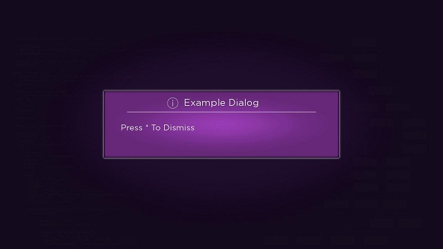
Again, the first step to show a dialog is to create a dialog node object, in this case, creating a Dialog node class object. The next step is configure the dialog node object. In this example, we set a custom background for the dialog, by setting the backgroundUri field to the location of a custom 9-patch PNG graphic image. Then we configure the dialog title by setting the string to be used as the value of the title field. We want users to be able to dismiss this dialog by pressing the Options remote key in addition to the default Back key, so we set the optionsDialog field value to true. And finally, we add the message we want to convey to users by setting the message field value to the string to be used (this example does not have much of a message, just a reminder that the Options remote key can be used to dismiss the dialog).
So if you press the OK remote key as instructed, this is the dialog that is shown:

PinDialog Markup
Example Application: PinDialogExample.zip
Node Class Reference: PinDialog, PinPad
The PinDialog node class shows a dialog with an internal PinPad node. The obvious use for a PinDialog node is when you need a user to enter a personal identification number (or some other numeric verification number) in the application. When this condition occurs in your application, call something like showdialog() in pindialogscene.xml:
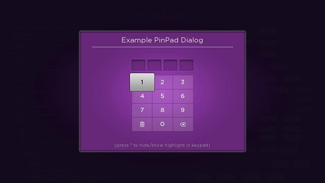
sub showdialog() pindialog = createObject("roSGNode", "PinDialog") pindialog.backgroundUri = "pkg:/images/rsgde_dlg_bg_hd.9.png" pindialog.title = "Example PinPad Dialog" m.top.dialog = pindialogend sub
The showdialog() function above configures the PinDialog node dialog to appear as follows:

For this example, we just set a custom background and a title for the PinDialog node object. In a typical application, you would want to add a button to the dialog to allow the user to inform the application that the number is complete, and have the application dismiss the dialog and get the entered number, when the button is pressed. The best way to do this is to set an observer on the Button node buttonSelected field to trigger a callback function that dismisses the dialog by setting the dialog object close field to true:
sub dismissdialog()
  m.userpin = m.top.dialog.pin
m.top.dialog.close = trueend sub
You can also configure aspects of the internal PinPad node by referring to the dialog object pinPad field. For example, to set the PIN length to six digits rather than the default four digits:
pindialog.pinPad.pinLength = 6
For the PinDialog node, the Options remote key toggles a privacy setting that hides the number focused in the PIN pad, and there is a message about this included by default in the dialog. You should not override this default behavior to ensure maximum security for your users.
KeyboardDialog Markup
Example Application: KeyboardDialogExample.zip
Node Class Reference: KeyboardDialog, Keyboard
The KeyboardDialog node class shows a dialog with an internal Keyboard node. The obvious use for a KeyboardDialog node is when you need a user to enter some type of alphanumeric information in the application. When this condition occurs in your application, call something like showdialog() in keyboarddialogscene.xml:
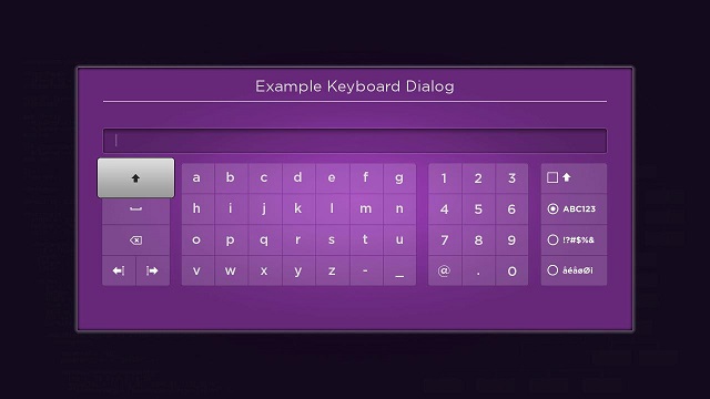
sub showdialog() keyboarddialog = createObject("roSGNode", "KeyboardDialog") keyboarddialog.backgroundUri = "pkg:/images/rsgde_dlg_bg_hd.9.png" keyboarddialog.title = "Example Keyboard Dialog" m.top.dialog = keyboarddialogend sub
The showdialog() function above configures the KeyboardDialog node dialog to appear as follows:

For this example, we just set a custom background and a title for the KeyboardDialog node object. In a typical application, you might want to add a button to the dialog to allow the user to inform the application that the alphanumeric text entry is complete, and have the application dismiss the dialog and get the entered alphanumeric string when the button is pressed, as described in PinDialog Markup. You can also configure aspects of the internal Keyboard node by referring to the dialog object keyboard field.
Also note that the internal Keyboard node uses the Options remote key to toggle a "caps lock" operation to make entering mixed-case strings easier.
ProgressDialog Markup
Example Application: ProgressDialogExample.zip
Node Class Reference: ProgressDialog, BusySpinner
The ProgressDialog node class shows a dialog with an internal BusySpinner node. The obvious use for a ProgressDialog node is when you want to inform a user that the application is taking some time to process information, maybe if a large download of data is occurring. When this condition occurs in your application, call something like showdialog() in progressdialogscene.xml:
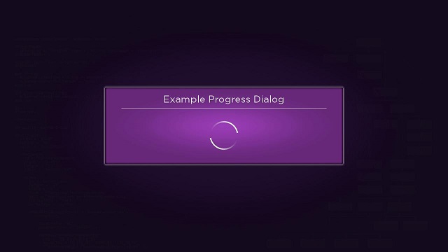
sub showdialog() progressdialog = createObject("roSGNode", "ProgressDialog") progressdialog.backgroundUri = "pkg:/images/rsgde_dlg_bg_hd.9.png" progressdialog.title = "Example Progress Dialog" m.top.dialog = progressdialog ...end sub
The showdialog() function above configures the ProgressDialog node dialog to appear as follows:

In an actual application, you'd want to call something like showdialog() before a time-consuming process is started in your application, then when the operation is complete, call a typical dismissdialog() function that sets the dialog object close field to true:
sub dismissdialog() m.top.dialog.close = trueend sub
Ideally, you'd want the dismissdialog() function to be a callback function triggered by an observed field change when the time-consuming process completes. For the example, we've simulated this using a Timer node, configured to run for three seconds before changing the fire field, which is observed to trigger the dismissdialog() callback function.
You can also configure aspects of the internal BusySpinner node by referring to the dialog object busySpinner field.
Attachments:
 DialogExample.zip (application/zip)
dialogdoc.jpg (image/jpeg)
DialogExample.zip (application/zip)
dialogdoc.jpg (image/jpeg)
 PinDialogExample.zip (application/zip)
pindialogdoc.jpg (image/jpeg)
PinDialogExample.zip (application/zip)
pindialogdoc.jpg (image/jpeg)
 KeyboardDialogExample.zip (application/zip)
keyboarddialogdoc.jpg (image/jpeg)
KeyboardDialogExample.zip (application/zip)
keyboarddialogdoc.jpg (image/jpeg)
 ProgressDialogExample.zip (application/zip)
progressdialogdoc.jpg (image/jpeg)
ProgressDialogExample.zip (application/zip)
progressdialogdoc.jpg (image/jpeg)
 DialogExample.zip (application/zip)
PinDialogExample.zip (application/zip)
KeyboardDialogExample.zip (application/zip)
ProgressDialogExample.zip (application/zip)
pindialogdoc.jpg (image/jpeg)
DialogExample.zip (application/zip)
PinDialogExample.zip (application/zip)
KeyboardDialogExample.zip (application/zip)
ProgressDialogExample.zip (application/zip)
pindialogdoc.jpg (image/jpeg)
 dialogdoc.jpg (image/jpeg)
pindialogdoc.jpg (image/jpeg)
keyboarddialogdoc.jpg (image/jpeg)
progressdialogdoc.jpg (image/jpeg)
dialogdoc.jpg (image/jpeg)
pindialogdoc.jpg (image/jpeg)
keyboarddialogdoc.jpg (image/jpeg)
progressdialogdoc.jpg (image/jpeg)