Example Application: MarkupGridExample.zip
Node Class Reference: MarkupGrid
The MarkupGrid node class uses the same methods as the MarkupList node class to create a custom grid item appearance.
In MarkupGridExample.zip, we use the same grid content meta-data as in PosterGrid Markup, but in this case we want to indicate focus on an item by making it brighter and enlarging it:
If you looked carefully at how the example in MarkupList Markup was created, you can guess that there is grid item component definition, which is in the markupgriditem.xml component file:
As in MarkupList Markup, we have the renderable nodes that will be part of the item appearance defined in the <children> element:
<children >
  <Poster
    id = "itemPoster"
    translation = "[ 10, 10 ]"
    width = "512"
    height = "288"
    scaleRotateCenter = "[ 256.0, 144.0 ]" >
    <Rectangle
      id = "itemMask"
      color = "0x101010FF"
      opacity = "0.75"
      width = "512"
      height = "288"
      scaleRotateCenter = "[ 256.0, 144.0 ]" />
  </Poster>
</children>
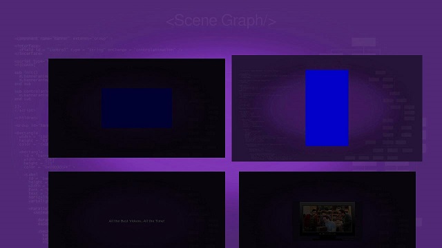
In this case, we define a Poster node, that will display the graphic image for the grid item. But note we set a scaleRotateCenter field value like we did in Rotated Renderable Nodes Markup, because we intend to scale up the size of the graphic image when the item is focused. We also set the translation field value to with a 10-pixel X,Y offset to accommodate the larger size of the image when scaled up.
Then we define a child Rectangle node we intend to use as a "mask" to dim the visibility of the Poster node when the item is not focused. Note that the child Rectangle node has the exact same dimensions as the parent Poster node, but the color field value is set to black, and the opacity field value is set to 0.75 for the default dimmed visibility of the Poster node when the item is not focused.
We use the same two <interface> fields used in MarkupList Markup. As in that example, a itemContent field value change triggers a setcontent() callback function, to populate the grid with graphic images, and a focusPercent field value change triggers the showfocus() callback function, to indicate focus has either been set on the item, or left the item:
sub showcontent()
  itemcontent = m.top.itemContent
  m.itemposter.uri = itemcontent.hdgridposterurl
end sub
sub showfocus()
  scale = 1 + (m.top.focusPercent * 0.08)
  m.itemposter.scale = [scale, scale]
  m.itemmask.opacity = 0.75 - (m.top.focusPercent * 0.75)
end sub
focusPercent field value is used to set both the visibility, and the scaling up/down of the grid image items, in the showfocus() callback function.If you compare the <children> element markup in the markupgridscene.xml component file with the equivalent markup in PosterGrid Markup and MarkupList Markup, you should be able to see how the standard PosterGrid node markup is modified to be used as a MarkupGrid node:
<children >
  <MarkupGrid
    id = "exampleMarkupGrid"
    translation = "[ 130, 160 ]"
    itemComponentName = "MarkupGridItem"
    numColumns = "2"
    numRows = "5"
    itemSize = "[ 532, 308 ]"
    itemSpacing = "[ 20, 20 ]"
    drawFocusFeedback = "false" />
</children>
itemSize field value is enlarged slightly over the equivalent PosterGrid node to accommodate the scaling up of the grid item graphic images when focused.