Table of Contents
Roku SceneGraph provides several "widget" node classes. Most of these should be very familiar if you have set up user interfaces for applications on other operating systems and platforms; others are more specific to the Roku platform:
- Button
- BusySpinner
- TextEditBox
- PinPad
- MiniKeyboard
- Keyboard
Button Markup
Example Application: ButtonExample.zip
Node Class Reference: Button
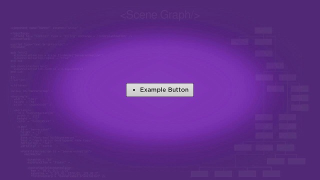
The Button node class allows you to add a button to your application. The buttonscene.xml component file adds a button simply by creating and configuring the Button node object in the <children> element of an XML component file:
<children > <Button id = "exampleButton" text = "Example Button" showFocusFootprint = "true" minWidth = "240" /></children>
This example mostly uses the default configuration for a Button node, with a few exceptions. The text field sets the string that will be used for the button, and is usually required so the user can know the operation that will occur if the button is selected by pressing the OK remote key. The showFocusFootprint is not required, but provides a visual indication as to whether the button is focused or not. And the minWidth field sets the minimum width of the button (which may be larger depending on the length of the string set as the value of the text field). For the user to use the button, the focus must be set on the Button node. In this example, that is done using the initialFocus attribute of the <component> element. All the remaining code in the buttonscene.xml component file just centers the button in the Scene node, resulting in the following:

In a real application, you'll want to set an observer on the buttonSelected field, to trigger a callback function that performs the operation selected by the user.
To add a group of several buttons to your application, see ButtonGroup Markup.
BusySpinner Markup
Example Application: BusySpinnerExample.zip
Node Class Reference: BusySpinner
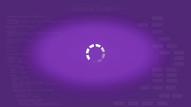
Roku SceneGraph provides indicators in many of the built-in node classes that a time-consuming operation is occurring in the application; for example, the internal ProgressBar nodes in the Video node class to let the user know that a little time is required to download enough of the video file to begin streaming playback. But in some cases you may need a progress indicator for a custom markup component operation.
The BusySpinner node class lets you add such a progress indicator anywhere in your application. But positioning the busy spinner in a scene or other component requires that the graphic image you use for the spinner be downloaded first, so the size of the spinner is known.
This is shown in the busyspinnerscene.xml component file, where we use an observer on the internal Poster node loadStatus field to trigger a callback function that positions the BusySpinner node:
 <component name = "BusySpinnerExample" extends = "Scene" >

  <script type = "text/brightscript" >

    <![CDATA[

    sub init()
      m.top.backgroundURI = "pkg:/images/rsgde_bg_hd.jpg"

      m.busyspinner = m.top.findNode("exampleBusySpinner")
      m.busyspinner.poster.observeField("loadStatus", "showspinner")
      m.busyspinner.poster.uri = "pkg:/images/busyspinner.png"

      m.top.setFocus(true)
    end sub


    sub showspinner()
      if(m.busyspinner.poster.loadStatus = "ready")
        centerx = (1280 - m.busyspinner.poster.bitmapWidth) / 2
        centery = (720 - m.busyspinner.poster.bitmapWidth) / 2
        m.busyspinner.translation = [ centerx, centery ]

        m.busyspinner.visible = true
      end if
    end sub

    ]]>

  </script>

  <children >

    <BusySpinner
      id = "exampleBusySpinner"
      visible = "false" />

  </children>

</component>
We create the BusySpinner node in the <children> element of the XML component file, but don't perform any important configuration there, except we do make the spinner initially invisible by setting the visible field to false. The important configuration takes place in the init() function in the <script> element, where we set the location of the graphic image to be used for the busy spinner as the value of the uri field of the internal Poster node. We set an observer on the loadStatus field of the internal Poster node to trigger the showspinner() callback function if any changes occur in the field.
The showspinner() function waits until the loadStatus field value is ready, then positions the spinner in the Scene node, finally setting the value of the BusySpinner node visible field to true. The result is as follows:

In a real application, you'd want to create and position a BusySpinner node component before beginning a time-consuming operation, and remove the spinner when the time-consuming operation has completed, ideally in a callback function triggered by an observed field set by the operation when complete.
You can also use the ProgressDialog node for many of the same purposes as the BusySpinner node. The ProgressDialog node shows a modal dialog that includes an internal BusySpinner node, and can display a message explaining the time-consuming operation to the user. See ProgressDialog Markup for an example of the ProgressDialog node.
TextEditBox Markup
Example Application: TextEditBoxExample.zip
Node Class Reference: TextEditBox
The TextEditBox node class is designed to display text as it is entered from a text entry widget, such as a Keyboard node. And that's why it is included as an internal node in the Keyboard and MiniKeyboard node classes. But the TextEditBox node is also available to display any text as it is entered by any method in your application.
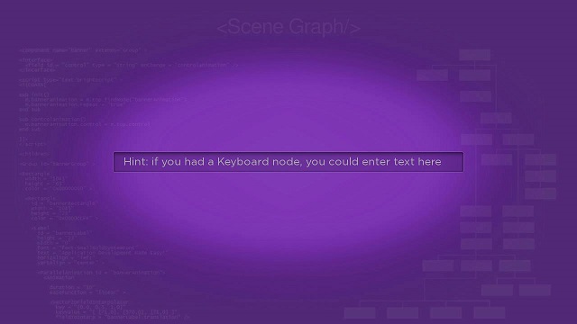
For this example, we've just set the hintText field to display a "hint" message to users before text entry begins, and set the width field to match the length of the hintText field value string, in the <children> element of the texteditboxscene.xml component file:
<children > <TextEditBox id = "exampleTextEditBox" width = "780" hintText = "Hint: if you had a Keyboard node, you could enter text here" /></children>
And the result is:
PinPad Markup
Example Application: PinPadExample.zip
Node Class Reference: PinPad
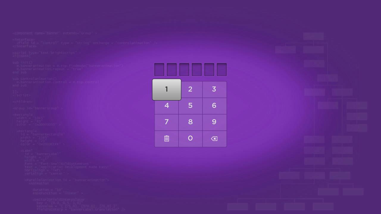
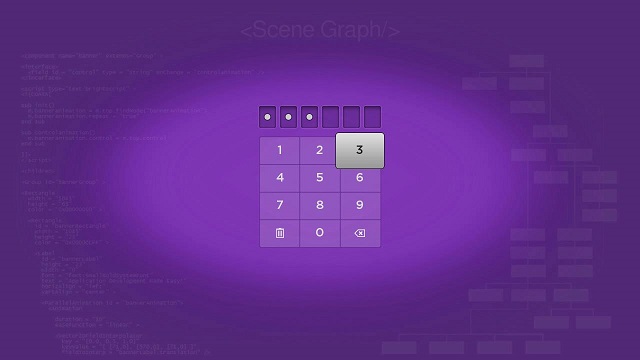
The PinPad node class supplies a widget that lets users enter a numeric personal identification or other type of verification number.
PinPadExample.zip creates a PinPad node object in the <children> element of the pinpadscene.xml component file. The PinPad node uses default values, except for the number of digits in the verification number, which is set to 6 rather than the default value of 4 in the pinLength field:
<children > <PinPad id = "examplePinPad" pinLength = "6" /></children>
And the result is:

In a real application, you would want to group the PinPad node with a button to allow the user to inform the application that the verification number entry is complete. Ideally, you should write a callback function to perform the application operations related to the verification number entry, triggered by an observer on the Button node buttonSelected field.
You can also use the PinDialog node to show a modal dialog with an internal PinPad node. The PinDialog node lets you add buttons to the dialog to allow the user to inform the application that the verification number entry is complete (and possibly to cancel the number entry), and can display a message explaining the verification number entry to the user. See PinDialog Markup for an example of the PinDialog node.
MiniKeyboard Markup
Example Application: MiniKeyboardExample.zip
Node Class Reference: MiniKeyboard
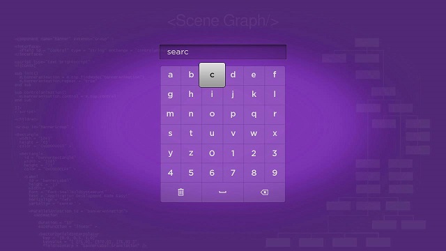
The MiniKeyboard node class provides a simple keyboard to allow the user to enter case-insensitive alphanumeric strings, without punctuation or other special characters. This keyboard can be used to enter search strings or other simple strings that do not require case-sensitivity or special characters.
The example MiniKeyboard node is created in the <children> element of the minikeyboardscene.xml component file with no custom field settings:
<children > <MiniKeyboard id = "exampleMiniKeyboard" /></children>
And the result is:
In a real application, you would probably want to group the MiniKeyboard node with a Button node (or possibly a ButtonGroup node) to allow the user to inform the application that the string entry is complete (or possibly canceled). Ideally you should write a callback function to perform the operation that requires the string, triggered by an observer on the Button node buttonSelected field.
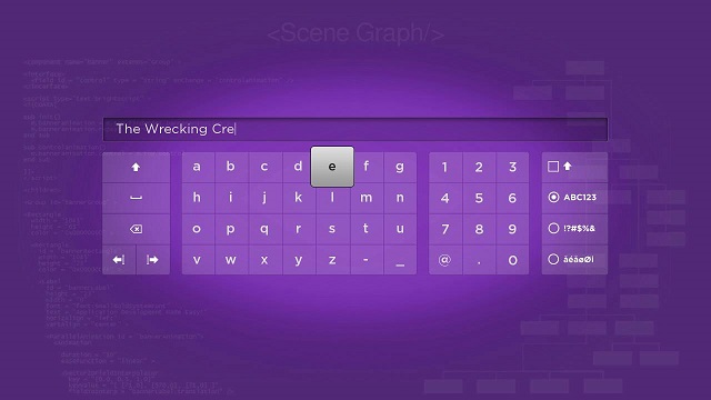
Keyboard Markup
Example Application: KeyboardExample.zip
Node Class Reference: Keyboard
The Keyboard node class allows full case-sensitive alphanumeric string user input, including punctuation and special characters.
Like the example MiniKeyboard node, the Keyboard node is created in the <children> element in keyboardscene.xml with no custom field settings:
<children > <Keyboard id = "exampleKeyboard" /></children>
And the result is:

In a real application, you would probably want to group the Keyboard node with a Button node (or possibly a ButtonGroup node) to allow the user to inform the application that the string entry is complete (or possibly canceled). Ideally you should write a callback function to perform the operation that requires the string, triggered by an observer on the Button node buttonSelected field.
You can also use the KeyboardDialog node to show a modal dialog with an internal Keyboard node. The KeyboardDialog node lets you add buttons to the dialog to allow the user to inform the application that the string entry is complete (and possibly to cancel the entry), and can display a message explaining the string entry to the user. See KeyboardDialog Markup for an example of the KeyboardDialog node.
Attachments:
 ButtonExample.zip (application/zip)
buttondoc.jpg (image/jpeg)
ButtonExample.zip (application/zip)
buttondoc.jpg (image/jpeg)
 BusySpinnerExample.zip (application/zip)
TextEditBoxExample.zip (application/zip)
texteditboxdoc.jpg (image/jpeg)
BusySpinnerExample.zip (application/zip)
TextEditBoxExample.zip (application/zip)
texteditboxdoc.jpg (image/jpeg)
 PinPad.zip (application/zip)
pinpad.jpg (image/jpeg)
PinPad.zip (application/zip)
pinpad.jpg (image/jpeg)
 pinpaddoc.jpg (image/jpeg)
 MiniKeyboardExample.zip (application/zip)
minikeyboarddoc.jpg (image/jpeg)
MiniKeyboardExample.zip (application/zip)
minikeyboarddoc.jpg (image/jpeg)
 KeyboardExample.zip (application/zip)
keyboarddoc.jpg (image/jpeg)
KeyboardExample.zip (application/zip)
keyboarddoc.jpg (image/jpeg)
 busyspinnerdoc.jpg (image/jpeg)
 PinPadExample.zip (application/zip)
ButtonExample.zip (application/zip)
BusySpinnerExample.zip (application/zip)
TextEditBoxExample.zip (application/zip)
PinPadExample.zip (application/zip)
MiniKeyboardExample.zip (application/zip)
KeyboardExample.zip (application/zip)
buttondoc.jpg (image/jpeg)
PinPadExample.zip (application/zip)
ButtonExample.zip (application/zip)
BusySpinnerExample.zip (application/zip)
TextEditBoxExample.zip (application/zip)
PinPadExample.zip (application/zip)
MiniKeyboardExample.zip (application/zip)
KeyboardExample.zip (application/zip)
buttondoc.jpg (image/jpeg)
 busyspinnerdoc.jpg (image/jpeg)
 texteditboxdoc.jpg (image/jpeg)
 pinpaddoc.jpg (image/jpeg)
 minikeyboarddoc.jpg (image/jpeg)
 minikeyboarddoc.jpg (image/jpeg)
 keyboarddoc.jpg (image/jpeg)
 buttondoc.jpg (image/jpeg)
busyspinnerdoc.jpg (image/jpeg)
texteditboxdoc.jpg (image/jpeg)
pinpaddoc.jpg (image/jpeg)
minikeyboarddoc.jpg (image/jpeg)
keyboarddoc.jpg (image/jpeg)
buttondoc.jpg (image/jpeg)
busyspinnerdoc.jpg (image/jpeg)
texteditboxdoc.jpg (image/jpeg)
pinpaddoc.jpg (image/jpeg)
minikeyboarddoc.jpg (image/jpeg)
keyboarddoc.jpg (image/jpeg)