Table of Contents
Finally, let's put together all the examples we've seen previously in the tutorial, to create a typical Roku SceneGraph application. As with every application, this application has a purpose. And the purpose of this application is to present all the various node classes and design/development principles for Roku SceneGraph, to let you quickly select node classes and design ideas for your application.
Example Application: SceneGraphTutorial.zip
Tutorial Application Overview
First, "side-load" the tutorial application and operate it, see how the panels slide in the panel set, and how you can select an example to view.
Functional Description
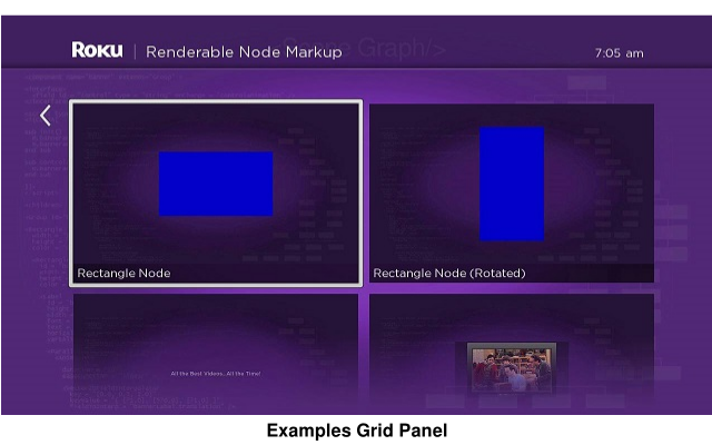
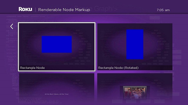
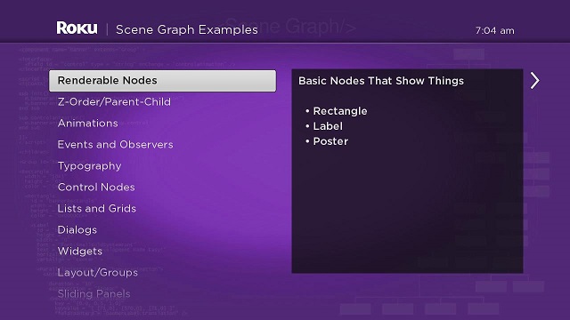
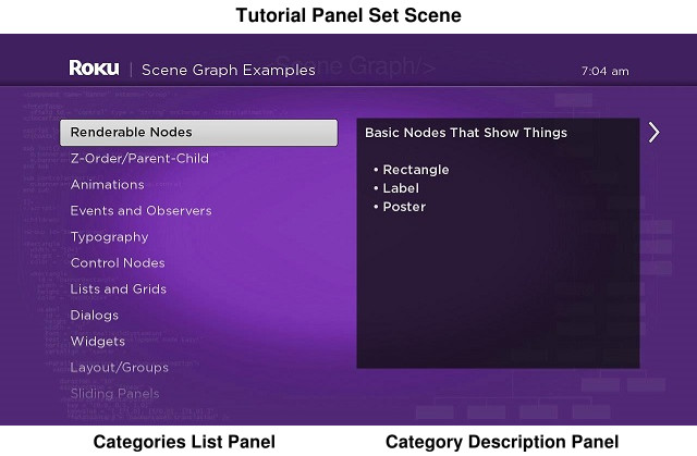
You'll note that there are three basic "screens" in the application. The application consists of a sliding panels panel set with three panels, and a "screen" for each example in the tutorial.
The first "screen" consists of a categories list panel (a medium-size panel), and a category description panel (another medium-size panel), as part of the tutorial panel set. If you press the remote control OK or Right key, a full-size examples grid panel slides into view, and moves the two medium-size panels out of view (the Overhang node title also changes from SceneGraph Examples to the name of the example category as shown in this tutorial). If you select an example by pressing the remote OK key while the focus indicator is on the example image, you'll see the example in action as the examples grid panel is replaced by the example "screen". Pressing the Back key while in the example "screen" causes the examples "screen" to be replaced by the examples grid panel; pressing Back (or Left when the focus indicator is on a left-hand grid image) slides the examples grid panel off the screen and replaced with the original two medium-size panels.

Files and Directories
Looking at SceneGraphTutorial.zip, you'll note that the package components directory consists of the following XML component files and subdirectories:
XML Component Files
These XML component files are the main application files.
tutorialpanelsetscene.xml
The scene component for the application, extended from the OverhangPanelSetScene node classcontentreader.xml
A generic Task node for reading Content Meta-Data for application content items from server XML filescategorieslistpanel.xml
A medium-size ListPanel node that lists the example categoriescategoryinfopanel.xml
A medium-size Panel node that provides a description of each example category focused in the categories list panelexamplesgridpanel.xml
A full-size GridPanel node that provides a grid of example posters for user selection of each example
Subdirectories
Each of the subdirectories in the components directory contains the XML component files for each example seen in this tutorial. In most cases, the XML component file is identical to the corresponding file for each tutorial example, except it is extended from either the Group node, or the node class of the example, rather than from a scene node as for the tutorial examples. There are also the some minor differences in the code and XML markup that reflect the difference between component files extended from a scene node class, and those that are extended from other node classes.
- renderablenodes
Contains the XML component files for the examples in Renderable Node Markup - zorderparentchild
Contains the XML component files for the examples in Z-Order/Parent-Child Markup - animations
Contains the XML component files for the examples in Animation Markup - eventsobservers
Contains the XML component files for the examples in Events and Observers Markup - typography
Contains the XML component files for the examples in Typography Markup - controlnodes
Contains the XML component files for the examples in Control Nodes Markup - listsandgrids
Contains the XML component files for the examples in Lists and Grids Markup - widgets
Contains the XML component files for the examples in Widgets Markup - layoutgroups
Contains the XML component files for the examples in Layout/Groups Markup - slidingpanels
Contains the XML component files for the examples in Sliding Panels Markup - mediaplayback
Contains the XML component files for the examples in Media Playback Markup
Tutorial Application Scene Component Description
Note that if you've gone through the SceneGraph XML Tutorial from the beginning to here, there is very little contained in SceneGraphTutorial.zip that you haven't seen before. What this application does is pull together all the various SceneGraph nodes, components, designs, and development principles into a single application. So to complete the tutorial, we only need to describe certain aspects of the scene component file, tutorialpanelsetscene.xml, and how it pulls together the entire application, along with the associated server XML files.
Looking at tutorialpanelsetscene.xml, you'll see that there is no <children> element XML markup to define SceneGraph nodes and components. Rather, tutorialpanelsetscene.xml is used only to create, manipulate, and remove components in the application SceneGraph, which are defined in the all the other XML component files in the application components directory.
Initial Content Meta-Data Reading
In fact, a large part of tutorialpanelsetscene.xml just creates and manipulates the same panel set described in OverhangPanelSetScene Markup. The big difference is not the panels or their sliding behavior, but in the greater amount of Content Meta-Data supplied by the server XML files supplied for the application, and allowing users to select a specific example item to view from the grids created by the examplesgridpanel.xml file containing the content meta-data for each item.
To start the application, the init() function runs a typical Task node content reader to get the initial content meta-data for the application:
m.readContentTask = createObject("roSGNode", "ContentReader")
m.readContentTask.observeField("content", "setcategories")
m.readContentTask.contenturi = "http://www.sdktestinglab.com/Tutorial/content/categoriescontent.xml"
m.readContentTask.control = "RUN"
We're using the generic server XML file content reader Task node defined in contentreader.xml. If you have any questions about how this works, you could review Task Markup in this tutorial. In this case, once the ContentNode node containing the content meta-data is complete, it triggers the setcategories() callback function:
sub setcategories() m.categoriespanel = m.top.panelSet.createChild("CategoriesListPanel") m.categoriespanel.list.content = m.readContentTask.content
m.categoryinfopanel = m.top.panelSet.createChild("CategoryInfoPanel")
m.categoriespanel.list.observeField("itemFocused", "showcategoryinfo") m.categoryinfopanel.observeField("focusedChild", "slideexamplesgridpanel")
m.categoriespanel.setFocus(true)end sub
Dynamic Content Meta-Data Reading
The setcategories() callback function creates the categories list panel and category description panel defined in the categorieslistpanel.xml and categoryinfopanel.xml files, and adds them to the panel set. But importantly, when the ContentNode node created by the m.readContentTask object is assigned to the content field of the categories list panel object m.categoriespanel.list, the entire application is now set up to dynamically download additional content meta-data as needed by user actions.
To do this, we set up two field observers in the setcategories() function, one that observes the itemFocused field of the categories panel LabelList node, and the other to observe the focusedChild field of the category description panel. The first observer triggers a callback function that sends a category description to an <interface> field of the category description panel object m.categoryinfopanel, and creates an examples grid panel object to be populated with content meta-data dynamically by user focus on a category. The second controls the sliding of the panels in the panel set if the user selects a category, or presses the Right, Left, or Back remote control keys while focus is on a particular panel.
The key is that each item in the categoriescontent.xml server file contains another url content meta-data attribute that allows the rest of the application to dynamically load content meta-data from that URL:
<item title = "Renderable Nodes" description = "Basic Nodes That Show Things 
 
 • Rectangle 
 • Label 
 • Poster" shortdescriptionline1 = "Renderable Node Markup" url = "http://www.sdktestinglab.com/Tutorial/content/rendergrid.xml" />
So the title, description, and shortdescriptionline1 content meta-data attributes can all be used in the application when the user focuses or selects the item in the m.categoriespanel.list object, and the url attribute can be used to populate the examples grid panel with content meta-data downloaded from that URL. This is done when the showcategoryinfo() callback function is triggered by the user focusing on the category in the categories list panel list:
sub showcategoryinfo() categorycontent = m.categoriespanel.list.content.getChild(m.categoriespanel.list.itemFocused)
m.categoryinfopanel.description = categorycontent.description
m.examplespanel = createObject("roSGNode", "ExamplesGridPanel")
m.examplespanel.overhangtext = categorycontent.shortdescriptionline1 m.examplespanel.gridcontenturi = categorycontent.urlend sub
The function first extracts the content meta-data for the category item by accessing the child ContentNode node for the item, using the getChild() method with the itemFocused field value of the categories list panel list as the parameter. After that, the item content meta-data description attribute is assigned to the description <interface> element field of the categories description panel, causing that panel to display the description of the category. Then the examples grid panel object m.examplespanel is created, and the object overhangtext and gridcontenturi fields are assigned the values of the shortdescriptionline1 and url content meta-data attributes.
So the examples grid panel is dynamically created and populated with content meta-data every time the user focuses on an item in the categories list panel list. Since the examples grid panel is configured to automatically download its content meta-data from its gridcontenturi <interface> element field, and configure the appearance of the panel based on the downloaded content meta-data, this download and configuration largely takes place before the user actually selects the category item. This automatic dynamic behavior makes the application feel quick and responsive to user actions; you can confirm this by actually using the application.
Running New Components Based On User Selection
The goal of a video-on-demand application is to allow a user to select a video for playback. Roku SceneGraph provides a wide variety of UI elements to allow a user to proceed from starting the application to actually playing the video in a variety of different ways, with many different custom UI designs possible. Note that all of the lists and grids, widgets, other built-in node classes, and custom markup components you create, can be used in virtually unlimited combinations and variations to design a unique user interface for your VOD application.
At the point at which the user is ready to select a video (or for that matter, an audio file) for playback, you'll want to have a field observer set up to trigger the callback function that will actually perform the media playback. Generally this will be an observer on an itemSelected (or equivalent) field in a list or grid.
In our tutorial application, we set up this type of observer in the slideexamplesgridpanel() callback function. This function is triggered by a focus on the categories description panel, is designed to detect whether the user has moved the focus to the examples grid panel, and take the appropriate actions:
sub slideexamplesgridpanel() if not m.top.panelSet.isGoingBack m.top.panelSet.appendChild(m.examplespanel)
m.examplespanel.grid.observeField("itemSelected", "runselectedexample") m.examplespanel.grid.setFocus(true)
else m.categoriespanel.setFocus(true)
end if end sub
The function first checks if the user is causing the panels in the panel set to slide to left or right. If the slide is towards the examples grid panel, the previously-created (and -configured) panel is added to the panel set using the appendChild() method. Then we set the observer on the itemSelected field of the examples grid panel grid, and move the focus to the panel. (If the user is causing the panels to slide the other way, towards the categories list panel, we set the focus on that panel.)
Now it's all up to the user (as always)...
Replacing Old Screens With New Screens
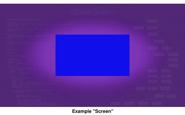
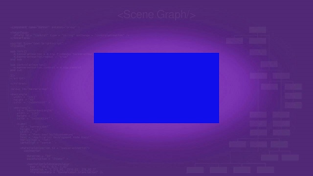
The runselectedexample() callback function is largely the endpoint for this tutorial application. The application was designed to show the built-in node classes and design principles of Roku SceneGraph, and the runselectedexample() function replaces the example grid panel (and panel set) with a "screen" showing a Roku SceneGraph example in action, after a user selects an item in the examples grid panel.
Remember how we used the url content meta-data attribute to configure the examples grid panel with dynamically-loaded content meta-data? This is the format of the server XML file content meta-data for each item in the examples grid panel:
<item hdgridposterurl = "http://www.sdktestinglab.com/Tutorial/images/rectanglepg.jpg" shortdescriptionline1 = "Rectangle Node" shortdescriptionline2 = "RectangleExample" x = "0" y = "0" />
Most of the content meta-data attributes are used to configure the PosterGrid node in the examples grid panel. But one, shortdescriptionline2, is used to supply the name of one of the dozens of components defined in XML files in the package components sub-directories. And with that name, we can create and add the example item as a "screen" to the application. Note these lines in the runselectedexample() callback function:
examplecontent = m.examplespanel.grid.content.getChild(m.examplespanel.grid.itemSelected)example = examplecontent.shortdescriptionline2
First we access the specific item ContentNode node using the getChild() method, with the examples panel grid itemSelected field as the method parameter. Then we use string value of the attribute (the name of the component to run, as set in the name field of the <component> element) to create the example component object, and append the component object to the panel set scene, while making the actual panel set itself invisible, and setting focus on the new component:
m.top.overhang.visible = falsem.top.panelset.visible = false
m.currentexample = createObject("roSGNode", example)
m.top.appendChild(m.currentexample)
m.currentexample.setFocus(true)
And with that, the panel set "screen" is replaced with the m.currentexample object screen, which generally appears just like the example with the corresponding name seen throughout this entire tutorial.
Replacing New Screens With Old Screens
In some cases, the new example "screens" are essentially complete applications themselves, with their own content meta-data, and have their own user selection "endpoint" (such as the video list example, the same example described in Video List Markup, which can play several user-selected videos).
So after you've looked at one example, you'll want to go back to the main example selection application, to look at another example. Since the standard Roku UI for "going back" to a previous "screen" is to press the remote control Back key, we'll have to write an onKeyEvent() function to handle the Back key press to "return" to the examples grid panel. This is how this is handled in tutorialpanelsetscene.xml:
function onKeyEvent(key as String, press as Boolean) as Boolean if press then if key = "back"
if (m.currentexample <> invalid) m.top.removeChild(m.currentexample) m.currentexample = invalid
m.top.overhang.visible = true m.top.panelset.visible = true
m.examplespanel.setFocus(true)
return true end if end if end if
return falseend function
As described in Key Events Markup, the remote key press to handle is conditionalized, the actions to take for that key press are defined, then the function returns true to stop any further automatic handling of that key press (otherwise a Back key press could cause the entire application to exit). In this case, in the Back key press condition, we check if an example is currently running, by checking that the m.currentexample object we created for the example exists. If so, we delete it from the SceneGraph using removeChild(), and mark it as invalid so any further Back key presses will not meet the key press handling condition. Then we make the scene Overhang and PanelSet nodes visible again, and set the focus back on the examples grid panel.
And that's how you replace a new "screen" with an old "screen" in Roku SceneGraph...
What About The Dialog Node Examples?
If you're actually looking at the runselectedexample() callback function in tutorialpanelsetscene.xml, you've probably noticed we handled the various dialog node examples differently.
That's because the dialog node classes are created and appear when the scene component dialog field is set to a dialog node object. So for the dialog node examples, we check for the example component name, and if it is one of the dialog node examples, we create the dialog object, configure the dialog appearance and behavior, and then assign the configured dialog object to the scene dialog field:
if (example = "DialogExample") dialog = createObject("roSGNode", "Dialog") dialog.backgroundUri = "pkg:/images/rsgde_dlg_bg_hd.9.png" dialog.title = "Example Dialog" dialog.optionsDialog = true dialog.message = "Press * To Dismiss" m.top.dialog = dialog
That's about all there is to it, except in the case of the ProgressDialog node example. There we set up a Timer node to simulate a condition that takes a few seconds to occur, and use a field observer on the Timer node fire field to trigger the simple dismissdialog() callback function to close the dialog (see ProgressDialog Markup for a complete description of this simulated dialog closing condition).
Attachments:
 videobanner.zip (application/octet-stream)
videobanner.zip (application/zip)
videobanner.zip (application/zip)
videobanner.zip (application/zip)
videobanner.zip (application/zip)
VODBanner.zip (application/zip)
SceneGraphTutorial.zip (application/zip)
SceneGraphTutorial.zip (application/zip)
tutorialscenedoc.jpg (image/jpeg)
videobanner.zip (application/octet-stream)
videobanner.zip (application/zip)
videobanner.zip (application/zip)
videobanner.zip (application/zip)
videobanner.zip (application/zip)
VODBanner.zip (application/zip)
SceneGraphTutorial.zip (application/zip)
SceneGraphTutorial.zip (application/zip)
tutorialscenedoc.jpg (image/jpeg)
 tutorialexamplesdoc.jpg (image/jpeg)
 tutorialexampledoc.jpg (image/jpeg)
 SceneGraphTutorial.zip (application/zip)
SceneGraphTutorial.zip (application/zip)
tutorialscenedoc.jpg (image/jpeg)
SceneGraphTutorial.zip (application/zip)
SceneGraphTutorial.zip (application/zip)
SceneGraphTutorial.zip (application/zip)
tutorialscenedoc.jpg (image/jpeg)
 tutorialexamplesdoc.jpg (image/jpeg)
 tutorialexampledoc.jpg (image/jpeg)
 tutorialscenedoc.jpg (image/jpeg)
 tutorialscenedoc.jpg (image/jpeg)
 tutorialscenedoc14pt.jpg (image/jpeg)
 tutorialscenedoc14pt.jpg (image/jpeg)
 tutorialscenedoc14pt.jpg (image/jpeg)
 tutorialscenedoc14pt.jpg (image/jpeg)
 tutorialscenedoc14pt.jpg (image/jpeg)
 tutorialscenedoc14pt.jpg (image/jpeg)
 tutorialscenedoc14pt.jpg (image/jpeg)
tutorialexamplesdoc14pt.png (image/png)
tutorialexampledoc14pt.jpg (image/jpeg)
tutorialscenedoc14pt.jpg (image/jpeg)
tutorialexamplesdoc14pt.png (image/png)
tutorialexampledoc14pt.jpg (image/jpeg)